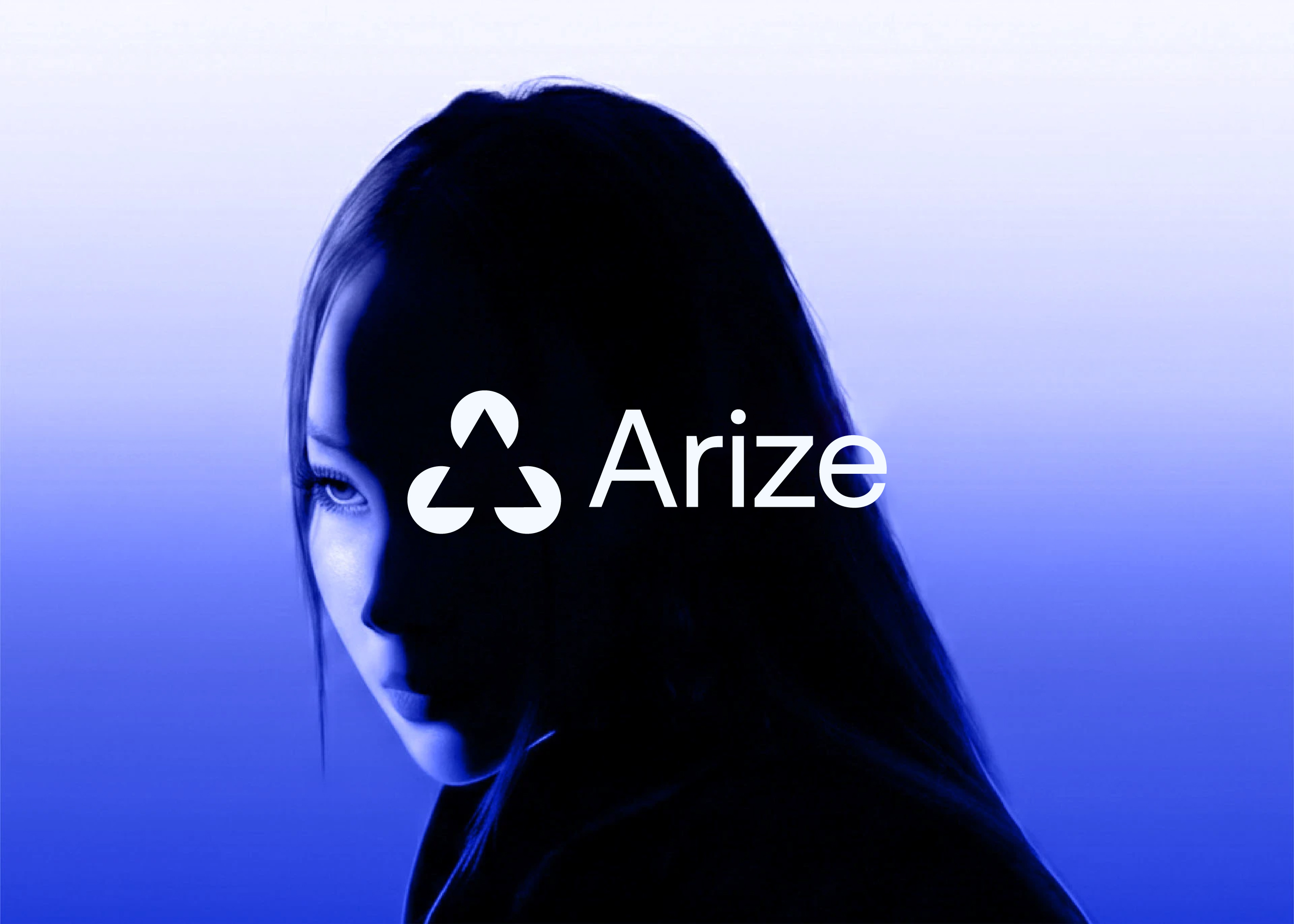
The Arize logo was designed for a platform that brings AI to life in the real world — giving engineers and data scientists the observability they need to monitor, evaluate, and improve AI systems in production. Not in theory, not in a lab, but in the environments where AI actually runs and where failures actually cost something.
The brief was specific: design an uplifting developer brand that communicates what Arize does at a glance. The name already carried the concept — rising, coming to life, standing up. The Arize logo and brand identity needed to make that concept visible in every context a developer encounters the product.
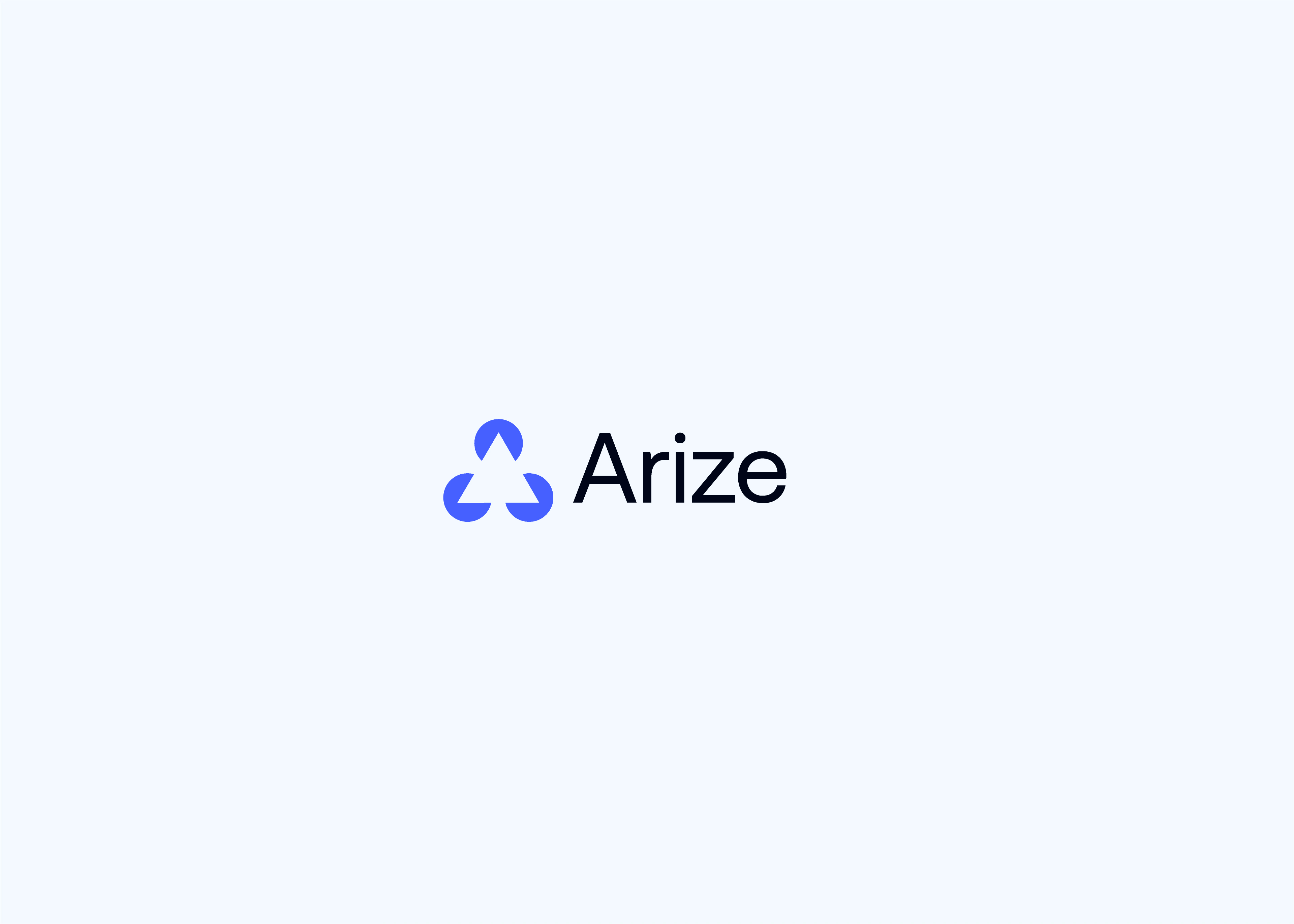
Arize Logo Concept: Translating the Name Into Geometry
"Arize" is not a neutral name. It carries direction — upward movement, activation, something dormant becoming real. The design brief asked us to take that concept seriously: not to illustrate it literally (an upward arrow, a rising sun), but to encode it in the geometry of the mark itself.
The result is an Arize logo mark built from three rising segments arranged in rotational symmetry, forming an abstract A through negative space. The form reads simultaneously as:
- The letter A — the first character of the brand name, present without being literal
- Three rising elements — lift, activation, AI coming to life in production
- A connected system — the three segments suggest interconnection and observability across a whole AI pipeline
How the Arize Logo Mark Was Built
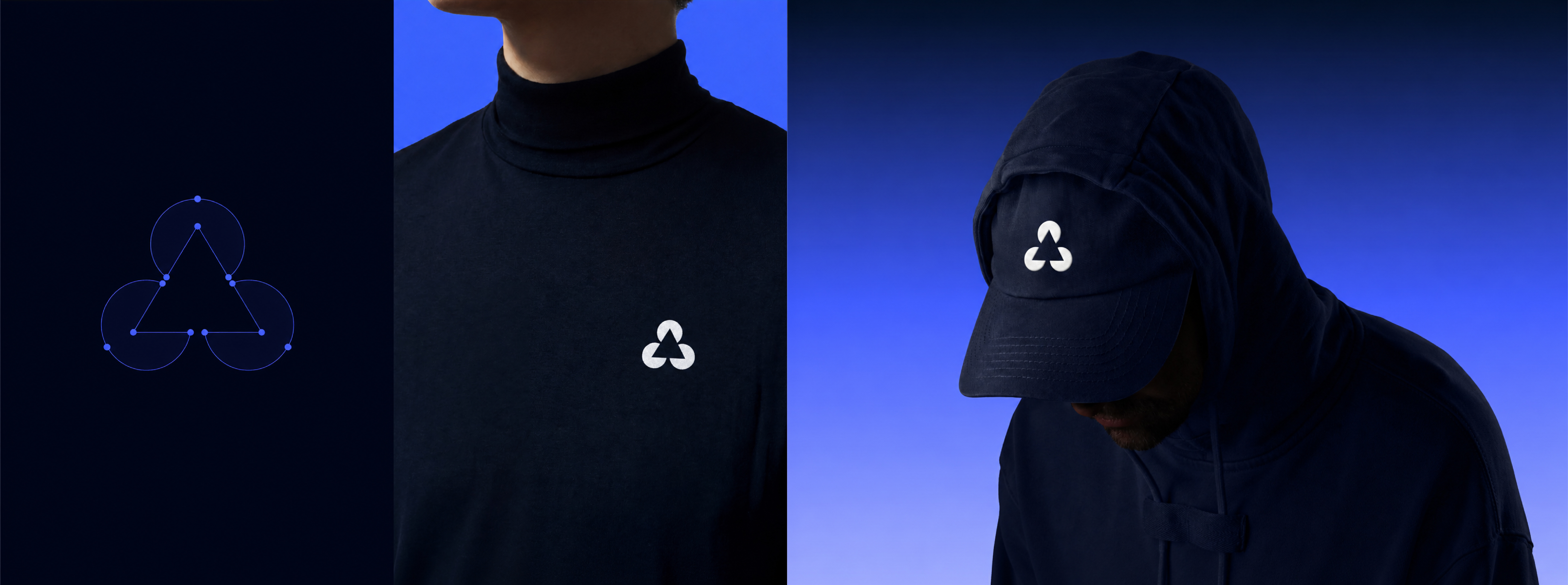
Every proportional decision in the Arize logo was made against a single criterion: does this hold at 16px in a browser tab?
Developer-first logos live in contexts consumer brand logos never encounter. An Arize logo at 512px in a brand guidelines document is not the same mark as the favicon in a developer's browser, the icon in a GitHub repository, or the watermark on a production dashboard. Each context requires the mark to work with no explanatory text, no colour support, and no generous space.
The Arize logo mark was constructed on a strict grid with:
- Even segment weight — all three rising elements carry identical stroke dimensions, communicating balance and precision
- Calibrated negative space — the gap that creates the A form is precisely proportioned to remain legible at small scales
- Rotational symmetry — the three-point balance means the Arize logo reads correctly in any orientation, critical for icon and app contexts
The construction geometry extended naturally into brand applications — apparel, headwear, and merchandise where the mark needed to hold its character without any supporting wordmark.
Arize Brand Typeface: Aeonik Pro
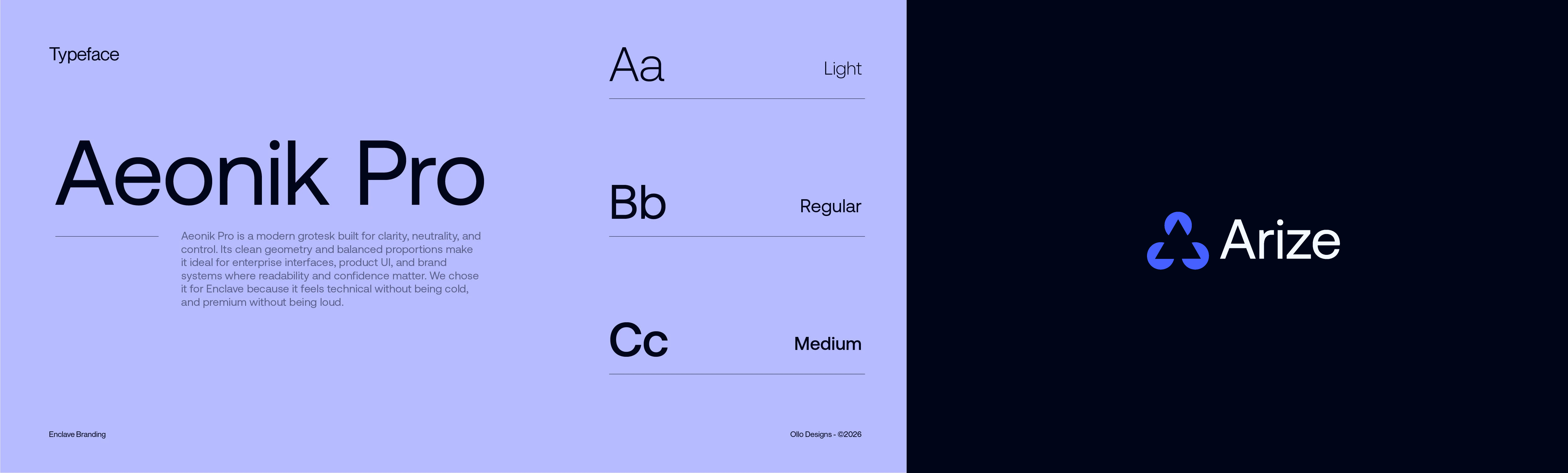
Aeonik Pro was selected as the Arize brand typeface after evaluation against the core requirement: technical without cold, premium without loud.
The grotesk is built for exactly the contexts Arize lives in — enterprise interfaces, product UI, and technical documentation where readability is not optional. Its clean geometry mirrors the proportional logic of the Arize logo mark. Its weight range (Light, Regular, Medium) gives the brand system the flexibility to scale from large display headers to small interface labels without switching typefaces.
The typeface system was defined across all weights and set cases, with the Arize logotype rendered in a specific weight and tracking that complements the geometric precision of the mark without competing with it.
Arize Brand Colour System
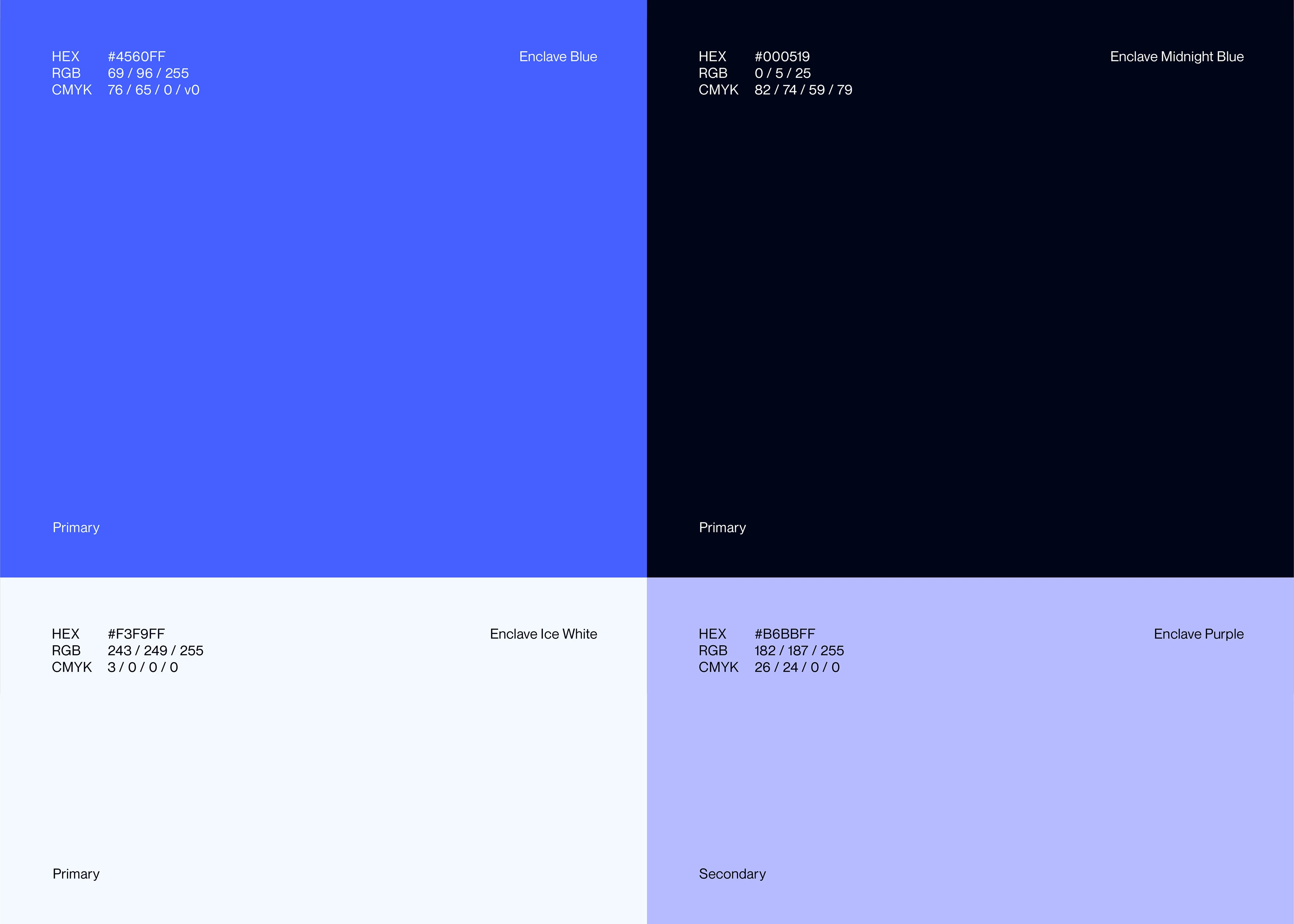
The Arize colour palette was built around one primary decision: the brand needed to feel at home in dark developer environments — dashboards, terminals, technical documentation — without losing legibility or warmth in light-mode contexts.
| Colour | Name | Hex | Role |
|---|---|---|---|
| Electric Blue | Enclave Blue | #4560FF | Primary — action, brand, interactive |
| Deep Navy | Midnight Blue | #000519 | Dark background, product UI |
| Near-White | Ice White | #F3F9FF | Light background, documentation |
| Soft Lavender | Enclave Purple | #B6BBFF | Secondary accent, data visualisation |
The primary blue was calibrated to hold WCAG AA contrast ratios in both dark and light contexts. The midnight background is not pure black — the slight blue cast keeps it coherent with the Arize brand palette and prevents the harshness that pure black creates in dark-mode developer interfaces.
The Arize Logo in Dark Mode
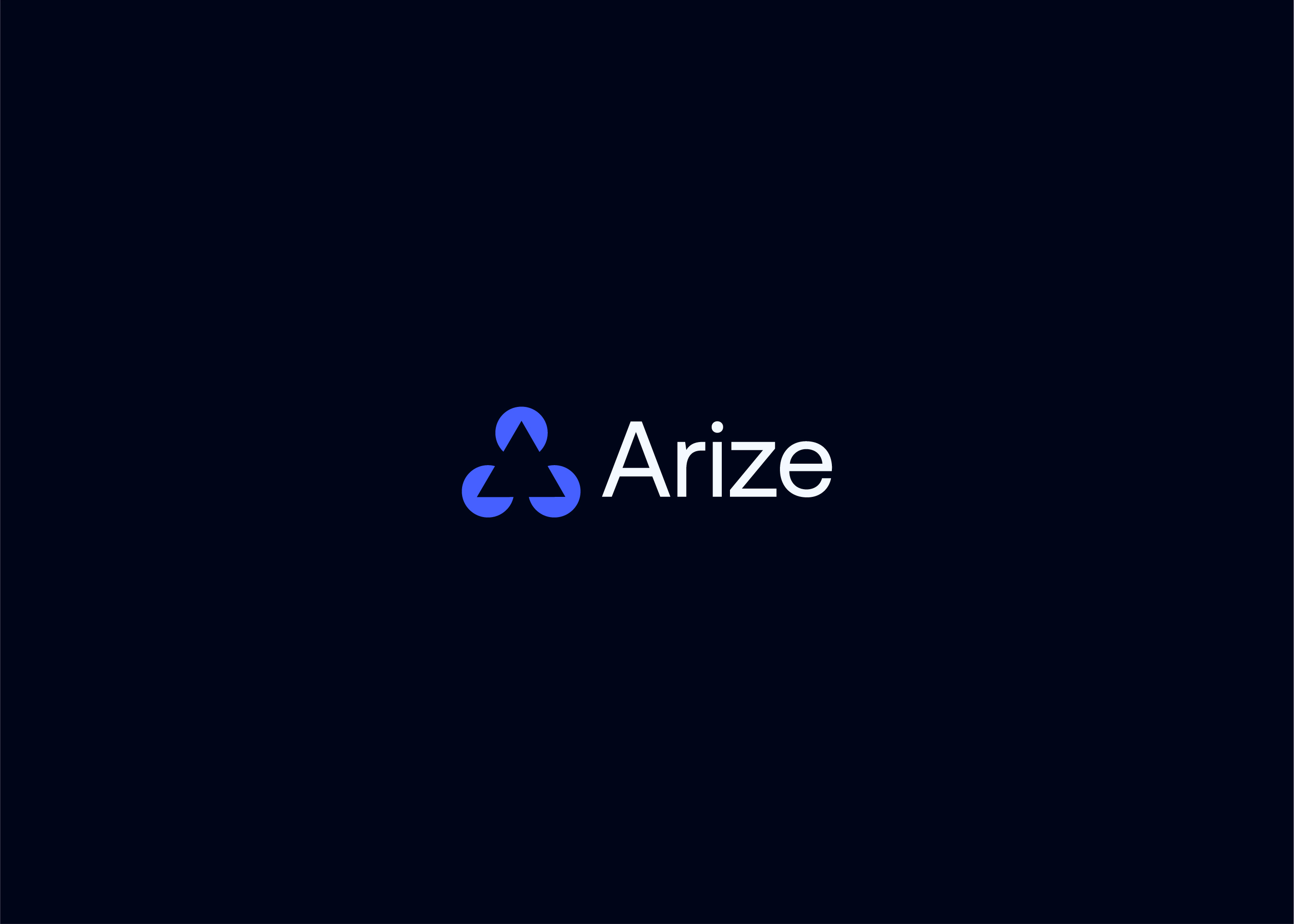
Developer products live in dark mode. The Arize logo and identity were designed dark-first — the white wordmark on midnight background was the reference application during colour development, not the light-mode version.
The decision to lead dark-first pays off in the product contexts that matter most: dashboard headers, CLI output branding, API documentation, and the GitHub repository profile where many developers will first encounter the Arize brand. The clean logo on deep navy is not an afterthought — it is the primary expression of the brand.
Arize Logo: Logomark, Logotype, and Brand System
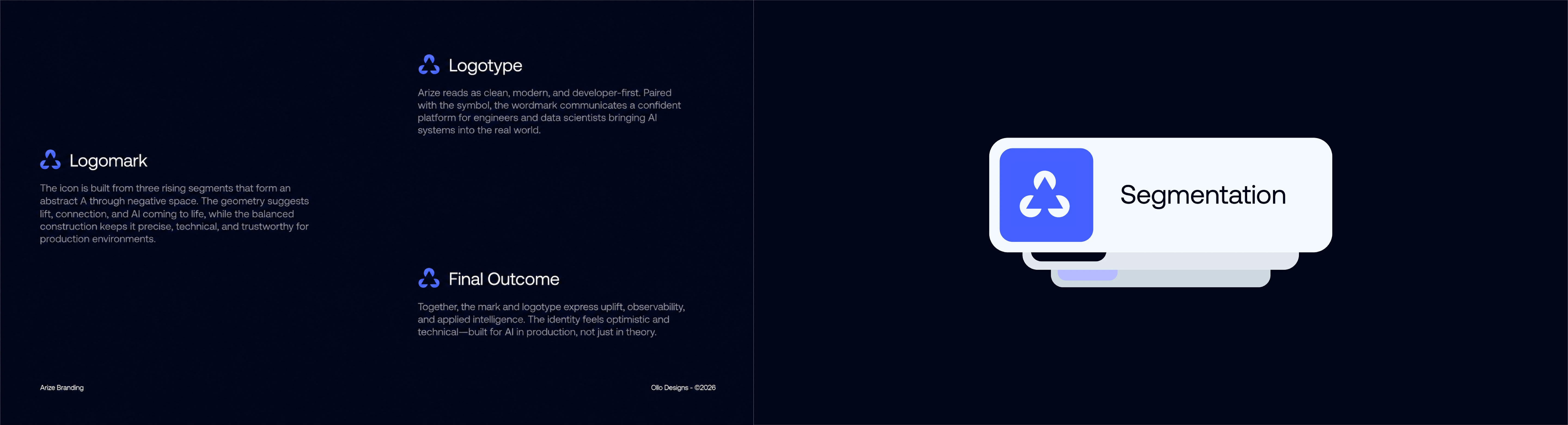
The combination mark — Arize logo symbol alongside the wordmark — was the primary lockup throughout the brand system. The logomark and logotype were spaced and proportioned as a single unit, not as an icon next to text, but as a fully designed combination where both elements are calibrated against each other.
The brand system documentation defined the mark roles precisely: the logomark for icon contexts, the logotype for wordmark-only applications, and the combination mark as the primary usage. Product UI applications — including the Segmentation product card — showed how the Arize logo integrates cleanly at interface scale without requiring modification.
The Arize logo works at all scales in every colour context:
- Full colour on light backgrounds (blue mark + dark wordmark)
- Full colour on dark backgrounds (blue mark + white wordmark)
- White reversed on any brand colour background
- Single-colour monochrome for single-ink print contexts
Arize Logo & Branding in Use: Digital Applications
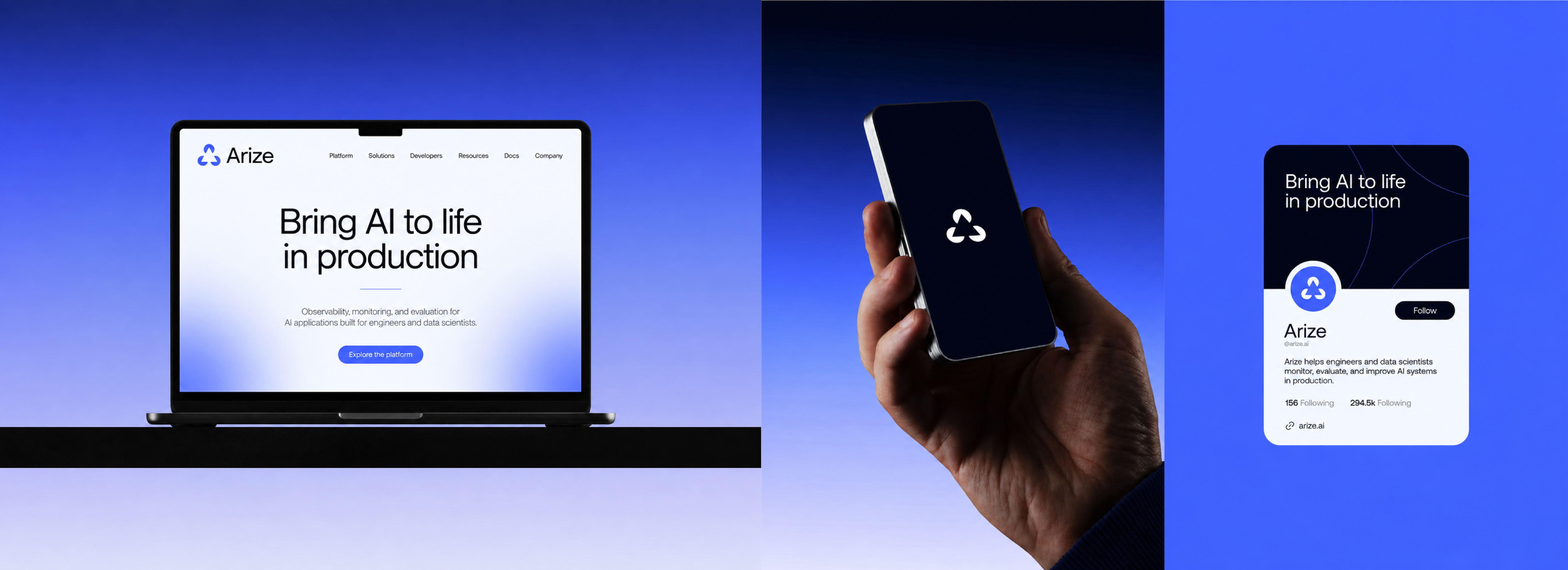
The Arize logo and brand identity extends across every digital touchpoint an AI platform encounters — from enterprise sales to developer community building.
The website hero — "Bring AI to life in production" — uses Aeonik Pro at large scale, keeping the Arize brand voice coherent from logo to product copy. The mobile lockup and social profile card demonstrate how the Arize logo mark carries its character at small sizes with no loss of legibility. The Twitter/X profile card shows the combination mark working in a constrained social context alongside the brand positioning line.
Arize Brand Photography and Editorial Direction
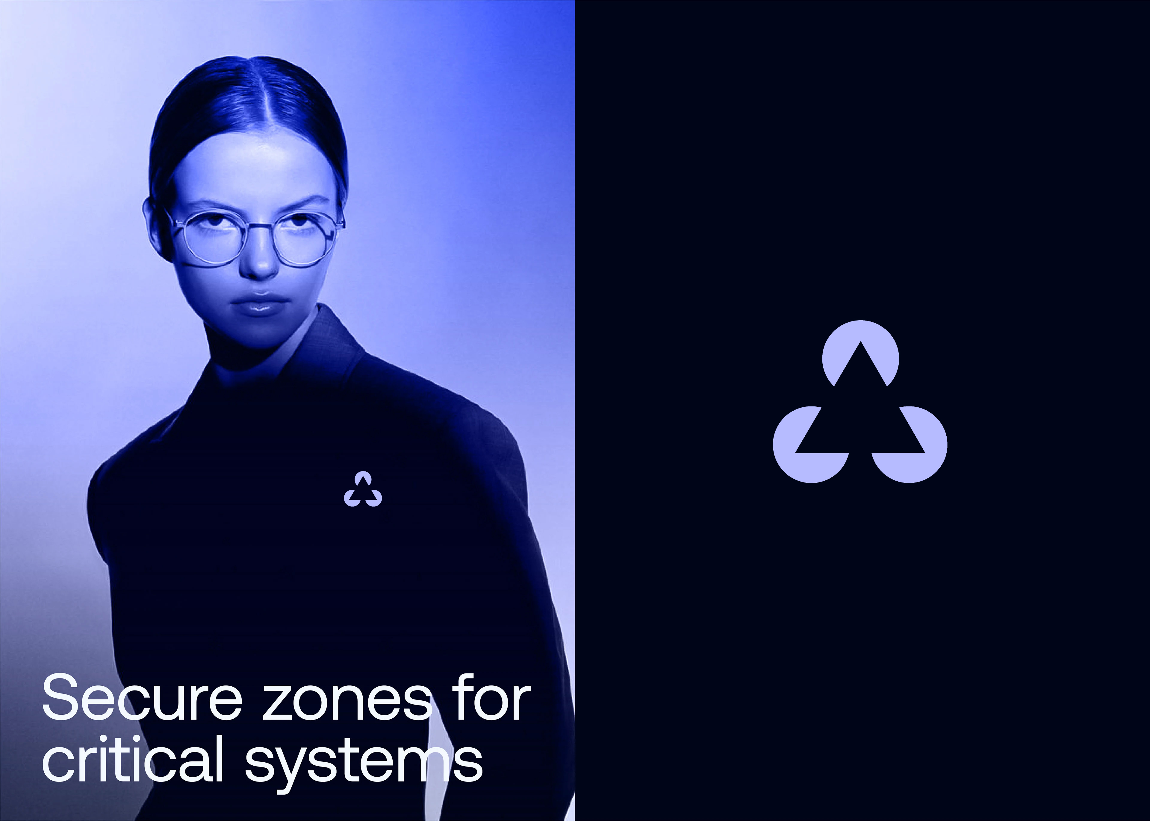
Beyond the functional brand system, the Arize identity required an editorial direction — a visual language for campaign and content contexts where the brand is present but not leading with a logo.
The brand photography direction uses the Arize brand palette as an environmental colour field: deep purple and midnight blue backgrounds, Enclave Purple as a large graphic element, and talent photographed in a way that reflects the developer audience — considered, precise, and without the generic "tech startup" visual clichés. The large-scale logo mark functions as both compositional element and brand anchor across editorial applications.
Arize Brand Collateral: Physical Applications
Physical collateral for a developer-first brand requires a specific editorial sensibility — it should feel as considered as the product, not an afterthought.
Business cards, packaging, and correspondence pieces were designed in the midnight palette with the Arize blue logo mark as the sole accent. The branded business card box and envelope carry the Arize identity into enterprise and partnership contexts — conferences, partnership meetings, investor materials — where the physical impression reinforces the digital brand.
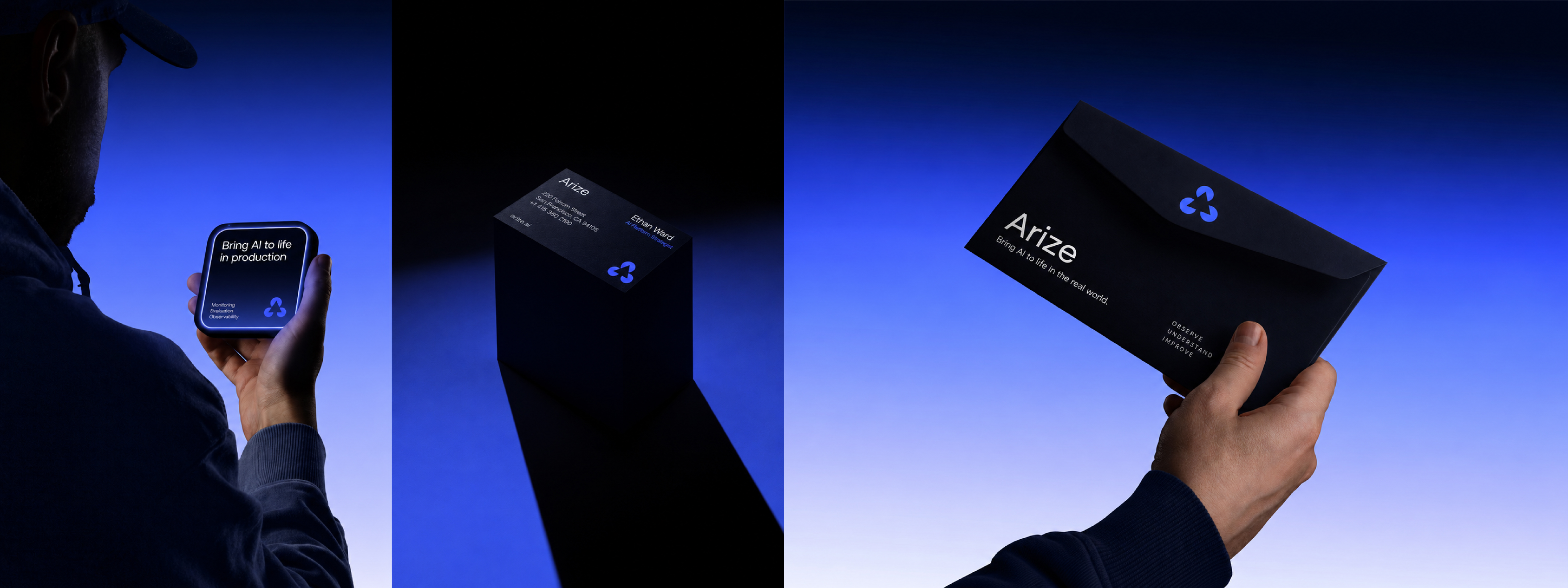
The envelope carries the Arize positioning line — "Bring AI to life in the real world" — alongside "Observe. Understand. Improve." — the three-word summary of what the platform does. These verbs were chosen deliberately: developer audiences respond to precision in language as much as precision in logo design.
Arize Brand in Print and Report Applications
The Arize brand system was extended to editorial print — brand reports, documentation, and the physical presence required for enterprise sales and investor contexts.
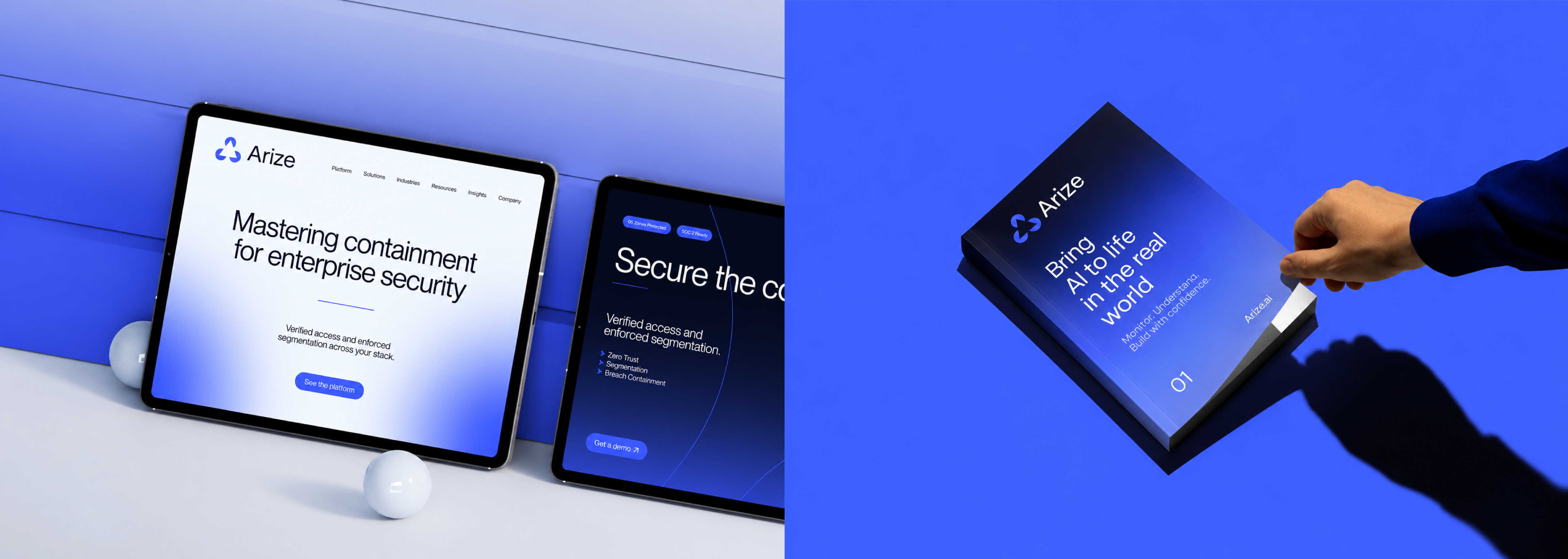
The "Bring AI to life in the real world" report format demonstrates the brand at a considered editorial scale — full-bleed colour, Aeonik Pro at display size, the Arize mark as anchor. The tablet applications show how the same visual system adapts from physical to screen without modification, keeping the brand coherent across the full range of enterprise touchpoints.
Need a logo and brand identity for an AI or developer product?
We design logos and brand identities for AI platforms, developer tools, and technical B2B companies — visual systems built for dark mode, small icons, enterprise sales decks, and every context between.