RealtyHook is a PropTech platform built for real estate professionals — connecting agents, brokers, and property investors with the tools and data they need to close faster and work smarter. The brief was to transform an early-stage identity into a brand that could hold its own against established real estate platforms while communicating the innovation advantage of a modern technology product.
The design challenge was dual: real estate credibility and technology modernity. Most brands in this space choose one and sacrifice the other.
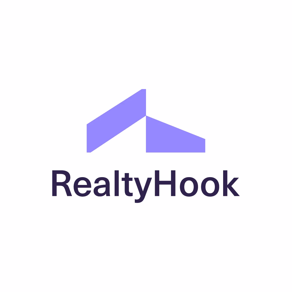
Bridging real estate and technology
The PropTech category sits at the intersection of two industries with completely different visual languages. Real estate has historically used dark blues, serif typography, and property imagery to signal trust and authority. Technology startups use clean geometry, sans-serif precision, and whitespace to signal innovation and speed.
RealtyHook needed both — and the brand identity system was designed to resolve that tension rather than pick a side.
The logomark integrates a property hook form — immediately readable as real estate context — with the precise geometric construction and clean proportions of a technology mark. The result is a logo that a real estate broker reads as professional and an investor reads as modern.
Colour system: trust and momentum
The colour palette was designed with the dual audience in mind:
- Primary — a confident, grounded tone that reads as institutional quality in real estate contexts
- Accent — a forward-motion energy colour communicating technology innovation
- Neutrals — a carefully calibrated range for UI, documentation, and print applications
Colour ratios in the guidelines specify how much of each palette appears in different contexts — more grounded in sales materials, more energetic in product UI and investor presentations.

Designed for PropTech product environments
Unlike most brand identity projects, PropTech brands live predominantly in digital product environments — SaaS dashboards, property listing interfaces, mobile applications. The RealtyHook identity was designed with these contexts as primary:
- Logo performs at small scale in product headers and mobile navigation
- Icon variant works as app icon and favicon at standard digital sizes
- Colour system meets WCAG accessibility standards for UI text and interactive elements
- Typography system selected for screen legibility across property listing data
Building a real estate or PropTech brand?
We design brand identities for real estate platforms, PropTech startups, and property companies — credible for industry professionals, modern enough for technology buyers. Serving clients in the USA, UK, Canada, and Australia.