
What typeface did Paula Scher create? If you’ve ever admired bold, unapologetic designs in graphic branding, you’ve likely encountered the influence of Paula Scher. She’s a true pioneer in the world of typography, leaving an indelible mark on the design landscape.
In this blog, we’ll explore the typefaces she’s most recognized for, the stories behind their creation, and how her work has shaped modern design.
Who is Paula Scher?
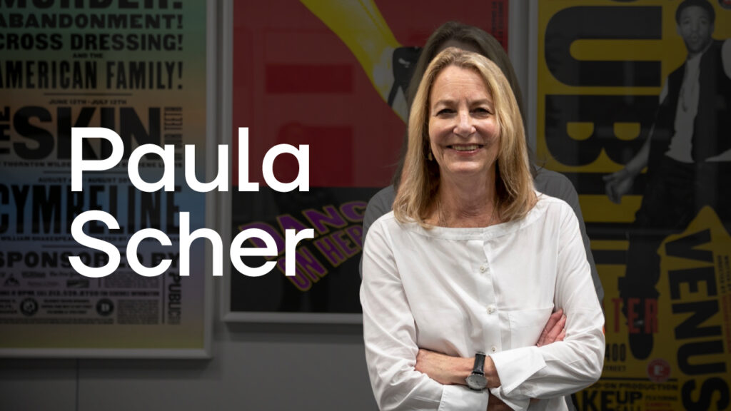
Paula Scher is one of the most iconic and influential graphic designers of our time. Her name is synonymous with bold, groundbreaking typography and innovative design. Over her career, which spans more than five decades, she has reshaped the way we think about visual communication.
Let’s dive deeper into her life, career, and impact.
A Trailblazer in Graphic Design
Paula Scher wasn’t always the design legend we know today. Her journey began in Washington, D.C., where she grew up surrounded by creativity. Her father, a cartographer, may have unknowingly inspired her love for structure and detail—qualities that would later define her work.
Early Life and Education
- Born: October 6, 1948, in Washington, D.C.
- Education: Scher studied at the Tyler School of Art in Philadelphia, where she majored in illustration. While she initially wanted to pursue fine art, she soon discovered her passion for graphic design.
After graduating, Paula moved to New York City in the 1970s, where her career truly began to take shape.
Breaking into the Design World
In the 1970s, Paula Scher worked as an art director for record companies, including CBS Records and Atlantic Records. This period was transformative for her career. Designing album covers gave her the freedom to experiment with bold typography and unconventional layouts.
Some of her key contributions during this era include:
- Designing over 150 album covers per year for CBS Records.
- Working with renowned artists like Bob Dylan and Leonard Bernstein.
- Developing a signature style that combined typography and imagery to create unforgettable designs.
Her experience in the music industry taught her the power of storytelling through visuals, a lesson she carried into her later work.
Partnering with Pentagram
By the early 1990s, Paula Scher joined Pentagram, one of the world’s most prestigious design firms. This was a pivotal moment in her career, as it allowed her to take on projects that would redefine her legacy.
At Pentagram, Scher worked with a wide range of clients, from cultural institutions to global corporations. Her designs are bold, expressive, and unapologetically modern, making her a standout figure in the industry.
Notable Projects
Some of her most celebrated work includes:
- The Public Theater: Scher redefined the visual identity of the Public Theater in New York, using bold, dynamic typography to make it more accessible and engaging.
- Citibank Logo: She famously sketched the logo for Citibank in just a few minutes on a napkin during a meeting.
- Microsoft Windows 8: Scher played a key role in creating a clean, modern design for the software giant.
- High Line in New York City: Her signage and environmental graphics for the High Line elevated its status as a cultural landmark.
Why Paula Scher is a Design Icon
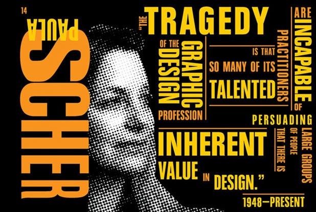
Paula Scher’s impact on design is monumental, not just because of her technical skills but also because of her fearless approach to creativity. Here’s what makes her stand out:
1. Revolutionizing Typography
Typography is at the heart of Paula Scher’s work. She uses type as a visual language, manipulating it to evoke emotions and communicate powerful messages.
- Scher’s work with typefaces like ITC Avant Garde Gothic and Helvetica Bold Condensed has set new standards in the design world.
- Her layered, overlapping text styles for projects like the Public Theater have inspired countless designers.
2. Cultural Influence
Scher’s work isn’t just about aesthetics; it’s about making statements. Her designs reflect cultural movements and push boundaries, making her a true innovator.
3. Education and Mentorship
As an educator, Paula Scher has taught and inspired generations of designers. Her influence extends beyond her work, as she’s committed to sharing her knowledge with others.
Fun Facts About Paula Scher
- The Napkin Story: Scher famously sketched the Citibank logo on a napkin in less than five minutes during a meeting. That sketch became one of the most recognizable logos in the world.
- Fine Art: In addition to graphic design, Scher is an accomplished painter. Her map paintings, which blend intricate details with bold visuals, are highly sought after.
- Accolades: She’s won numerous awards, including the AIGA Medal and induction into the Art Directors Club Hall of Fame.
Paula Scher’s Legacy
Paula Scher’s contributions to design are immeasurable. She has transformed the way we think about typography, branding, and storytelling through visuals. Her work remains timeless, proving that great design is not just about trends—it’s about impact.
If you’re inspired by Scher’s fearless creativity and want to bring bold design thinking into your brand, explore our work or brand strategy services.
Paula Scher is a force of nature in the design world. From her early days designing album covers to redefining corporate identities, she’s shown us that typography isn’t just letters on a page—it’s a powerful tool for communication.
Want to learn more about how bold design can transform your business? Let’s talk! Contact us today.
What Typeface Did Paula Scher Create?
Paula Scher is not credited with designing an entirely new typeface from scratch, but her contributions to typography have been revolutionary. She is most famously associated with the revival and reinvention of ITC Avant Garde Gothic, a typeface originally designed by Herb Lubalin and Tom Carnase in the 1970s.
While ITC Avant Garde Gothic existed before Scher’s involvement, her masterful reinterpretation of the typeface redefined its potential. She used it in bold and innovative ways that pushed the boundaries of typographic design.
- Breaking the Grid: Scher experimented with Avant Garde Gothic by breaking away from rigid typographic grids, allowing for more dynamic and fluid layouts.
- Layering and Overlapping: She introduced overlapping and layered type treatments, creating depth and movement in her designs. This approach was particularly groundbreaking at the time.
- Public Theater Campaigns: Scher’s iconic work for New York’s Public Theater showcased Avant Garde Gothic in a new light. She combined the typeface with bold colors and unconventional arrangements, making it feel alive and vibrant.
While Scher didn’t design the typeface itself, her ability to reimagine and adapt it demonstrates her genius as a designer. She took a tool and turned it into an art form, influencing how designers approach typography even today.
Influence of Typography in Paula Scher’s Work
For Paula Scher, typography isn’t just a design element—it’s the very soul of her work. She treats type as a visual language capable of evoking emotions, telling stories, and capturing attention. Her ability to manipulate typefaces into compelling compositions has cemented her legacy as one of the greatest graphic designers of all time.
Some of the key typefaces and techniques that define Scher’s career include:
1. Helvetica Bold Condensed
Scher’s use of Helvetica Bold Condensed is a masterclass in using typography to communicate with clarity and impact.
- Why She Chose It: Helvetica’s clean and modern design aligns perfectly with Scher’s bold, unapologetic style.
- Where It Shines: In her work for corporate clients, Scher used Helvetica to create identities that are professional yet approachable.
2. Franklin Gothic
Franklin Gothic, with its strong presence and versatility, has been a staple in many of Scher’s projects.
- Dynamic and Accessible: Scher used Franklin Gothic for projects that needed a dynamic yet accessible tone, such as campaigns for cultural institutions.
- Playful Compositions: She often combined Franklin Gothic with custom lettering to add personality to her designs.
3. Custom Lettering for the Public Theater
One of Scher’s most iconic achievements is her typographic work for the Public Theater in New York. This project showcased her ability to blend typography with cultural storytelling.
- Expressive Typography: Scher created custom lettering that was bold, energetic, and reflective of New York’s vibrancy.
- Layered Messaging: The overlapping text and mixed font weights became synonymous with the Public Theater’s identity.
- A Lasting Impact: Her work here not only elevated the theater’s brand but also set a new standard for how typography could be used in cultural and public spaces.
Typography as an Emotional Anchor
Paula Scher’s approach to typography isn’t just about aesthetics; it’s about making an emotional connection. She views type as a means of communication that goes beyond words.
Here’s how typography plays a foundational role in her designs:
- Setting the Tone: Whether she’s designing for a corporate client or a theater, Scher uses typography to immediately establish a mood.
- Challenging Conventions: Scher isn’t afraid to experiment with scale, spacing, and hierarchy. Her work often challenges traditional rules of typography to create something entirely new.
- Storytelling: For Scher, typography tells a story. The choice of typeface, the arrangement of letters, and the interplay of text with other design elements all contribute to a narrative.
Paula Scher’s Legacy in Typography
Paula Scher’s work has had a profound impact on the world of typography and design. She didn’t invent typefaces, but her ability to transform them into something greater has inspired generations of designers.
Her legacy is a reminder that typography is more than just a tool—it’s an art form that, when used with intention and creativity, can transform how we see and experience the world.
Want to explore how bold typography and strategic design can elevate your brand? Check out our work and discover how we help brands make their mark with compelling visuals and storytelling.
How Paula Scher Revolutionized Type Design
A New Voice for the Public Theater
One of Paula Scher’s most iconic typographic achievements is her groundbreaking design for the Public Theater in New York City. She didn’t just create posters or campaigns—she gave the institution a distinct visual identity that felt alive, dynamic, and deeply connected to the city it serves.
Scher’s work for the Public Theater used a mix of typefaces, primarily her bold reinterpretation of ITC Avant Garde and Akzidenz-Grotesk. What made this design revolutionary was her ability to combine these typefaces in a way that felt chaotic yet harmonious, creating a visual energy that matched the theater’s vibrant cultural presence.
- Layered Typography: Scher’s designs featured overlapping and densely packed text that seemed to leap off the page, evoking the bustling streets of New York.
- Bold and Accessible: By using type as the primary design element, Scher ensured the theater’s message was impossible to ignore while remaining legible and approachable.
- Cultural Resonance: Her work mirrored the diversity and dynamism of the city, making it not just a branding effort but a cultural statement.
This design became so iconic that it influenced a wave of typographic experimentation in theater and cultural branding across the world.
The Power of Typography in Branding
Paula Scher’s approach to typography goes far beyond aesthetics. For her, type is a powerful tool for establishing a brand’s identity, setting its tone, and communicating its values.
Her branding projects for major companies, including Citibank, Microsoft, and Windows 8, highlight the transformative potential of typography in branding.
- Citibank Logo: In a meeting that famously lasted only seconds, Scher sketched the Citibank logo on a napkin, integrating the “t” into an umbrella. This design, while simple, relies heavily on the clean and modern look of the accompanying typeface to convey trust, professionalism, and global reach.
- Windows 8: Scher brought a fresh typographic approach to the Windows 8 branding, emphasizing sleek, sans-serif fonts that communicated the software’s modernity and simplicity.
Why Typography Is More Than Readability
For Paula Scher, typography isn’t just about making text easy to read—it’s about using type to create an emotional connection. Her work demonstrates that a well-chosen and well-executed typeface can:
- Define a Brand: Typography helps shape how a brand is perceived, whether it’s bold and confident or elegant and refined.
- Capture Attention: Scher’s designs, especially for cultural institutions like the Public Theater, prove that type can be just as attention-grabbing as imagery.
- Tell a Story: Every typeface carries a personality and a history. By pairing the right font with the right project, Scher ensures the typography itself becomes a storytelling tool.
Through her work, Paula Scher has shown that typography isn’t merely functional—it’s transformational. Her revolutionary designs inspire designers worldwide to think of type as more than letters on a page but as a central force in visual communication.
Want to learn how bold typography can transform your brand identity? Check out our brand strategy and identity services to discover how we craft designs that resonate.
Why Paula Scher’s Work Matters
Paula Scher’s contributions to graphic design go beyond her striking visuals; her work is a catalyst for change, pushing the boundaries of what typography and design can achieve. Let’s delve into why her legacy matters and what makes her work so transformative.
Innovative Thinking
Scher redefined the role of typography, proving that it can be both playful and purposeful. Her designs don’t just communicate—they captivate. By bending and breaking traditional rules, she has shown that type can evoke emotions, challenge perceptions, and even set the tone for cultural movements.
Whether through bold lettering, unexpected compositions, or layered text, Scher’s work consistently pushes the envelope.
Cultural Impact
Scher’s designs for cultural institutions like MoMA, Jazz at Lincoln Center, and the Public Theater have become timeless symbols. These designs don’t merely represent the organizations—they amplify their missions.
Her work resonates with audiences because it feels authentic, modern, and deeply connected to the identity of each institution. Her influence extends beyond design; it has shaped how culture is visually represented in the modern era.
Legacy in Design
As a designer, educator, and thought leader, Scher has inspired countless creatives to think beyond the traditional limitations of typography. Her fearless approach has encouraged a new generation to embrace bold ideas, experiment with design, and challenge the status quo.
Today, her work serves as a blueprint for designers who want to combine artistic integrity with practical impact.
For businesses striving to embrace bold design thinking, Scher’s philosophy is a reminder of the importance of strategy and creativity.
At Evoke, we specialize in crafting brand identities that are not just visually stunning but also deeply meaningful. Learn more about our approach to brand strategy and identity and discover how we can help your business stand out in a crowded marketplace.
FAQs
Q. What typeface did Paula Scher create for the Public Theater?
Ans. Paula Scher didn’t design a new typeface specifically for the Public Theater, but she revolutionized how existing typefaces were used. She prominently utilized ITC Avant Garde Gothic and Akzidenz-Grotesk, combining them in layered, bold arrangements. This approach set a new standard for expressive and dynamic typography in cultural branding.
Q. How does Paula Scher use typography in her work?
Ans. Paula Scher uses typography as a storytelling tool. Her designs go beyond mere readability, manipulating:
- Scale: Enlarging key elements to demand attention.
- Space: Layering text to create depth and energy.
- Alignment: Playing with asymmetry for dynamic layouts.
Through these techniques, Scher ensures that her typography not only communicates but captivates.
Q. What makes Paula Scher’s typography iconic?
Ans. Paula Scher’s typography is iconic because it transforms typefaces into living, breathing visual elements. Key features include:
- Boldness: Her use of oversized, striking type grabs attention instantly.
- Layering: Overlapping text creates movement and depth.
- Clarity: Despite being artistic, her designs remain highly legible.
Scher’s work is memorable because it strikes the perfect balance between artistry and functionality.
Q. Which brands has Paula Scher designed for?
Ans. Paula Scher has left her mark on some of the world’s most recognizable brands and organizations. These include:
- Citibank: She designed the iconic Citi logo with its red arch.
- Microsoft: Contributed to software branding.
- The Public Theater: Created a bold visual identity that redefined cultural branding.
- Jazz at Lincoln Center: Developed a vibrant typographic style reflective of jazz’s energy.
Her diverse portfolio showcases her versatility and ability to adapt typography to fit any brand’s personality.
Q. How can I implement bold typography in my branding?
Ans. Bold typography can elevate your branding by creating a strong, lasting impression. Here’s how you can implement it:
- Choose the Right Typeface: Opt for fonts that match your brand’s personality (modern, playful, formal, etc.).
- Experiment with Scale: Use oversized text for headlines to draw attention.
- Leverage Contrast: Combine bold fonts with lighter, smaller text to add depth.
- Play with Layouts: Experiment with alignment, layering, and spacing to create visual interest.
- Be Purposeful: Ensure your typography aligns with your brand’s message and tone.
For expert guidance, check out our brand activation services. We can help you craft typography-driven designs that make your brand unforgettable.
Final Thoughts
Understanding what typeface Paula Scher created isn’t just about identifying a font; it’s about appreciating her mastery of typography as a design medium. Scher’s work reminds us of the power of type to tell stories, evoke emotions, and transform brands.
At Evoke, we specialize in creating impactful branding solutions that integrate bold, memorable typography. Want to learn more? Explore our work or contact us today to bring your vision to life.
Leave a Reply