A truck logo design is not just a picture on the side of your cab; it’s your silent handshake with every broker, dispatcher, and potential client on the road. For them, a cheap, generic, or poorly designed logo screams “unreliable.”
It makes them wonder if your operation is as haphazard as your branding. A strong, professional logo, however, does the opposite. It’s a powerful, instant signal of trust, reliability, and competence. It’s the visual proof that you run a serious business, and it’s often the deciding factor that gets you the high-value load over the other guy.
At Evoke, we’ve spent years building brands for companies that move the world. We don’t create decorations; we forge strategic tools that build trust and open doors. This isn’t about pretty pictures; it’s about perception, and in the logistics game, perception is money.
Why a Cheap Truck Logo Design is Costing You Money
Let’s get straight to it. That $50 logo you bought online? It’s probably costing you thousands. Every day, brokers and businesses are making split-second judgments. When they see a logo made from generic clip art or a forgettable font, a subconscious alarm bell goes off.
It’s an immediate red flag. It suggests you’re either new, unprofessional, or you cut corners. Why would they trust you with a six-figure load when your own brand looks like an afterthought?
The Traps of “Good Enough” Design
So many trucking companies fall into the same visual traps. They see a logo as a box to be checked, not as a core business asset.
- The Clip-Art Special: Using a generic truck silhouette that a hundred other companies are also using. It makes you completely invisible.
- The Highway to Nowhere: Slapping some swooshes or road lines on the company name. It’s generic and says absolutely nothing unique about your business.
- Default Font Fiasco: Just typing out your name in a basic font that comes with every computer. It shows a complete lack of investment in your own identity.
I once spoke with a broker who put it perfectly. He said, “If a company can’t be bothered to present itself professionally, I can’t trust them to handle the complexities of a cross-country haul.” He had two nearly identical bids in front of him. He chose the one with the more professional, solid-looking brand. That’s the real-world cost of a cheap logo.
It’s not just about looking good. It’s about building the immediate, non-verbal trust that is the currency of this industry. Our whole approach to brand strategy and identity is built on this foundation.
Our Approach to a Strategic Truck Logo Design
A logo should never be a one-size-fits-all solution. A family-owned long-haul business needs to communicate something very different from a logistics tech platform. Your logo has a specific job to do, and the design must be tailored to that mission.
We don’t start with sketches. We start with questions. Who are you trying to impress? What makes you different from the guy in the next lane? What is the single most important message you need to send? The answers to those questions dictate the entire design process.
Let’s look at a few real-world examples from our work to show you what I mean.
The Modern Solution: A Logo for a Logistics Tech Company (PTLS)
The Client: PTLS, a logistics company with a proprietary software application that connects trucking companies with pilot cars.
Their Challenge: They needed to look like a tech company, not a trucking company. Their audience isn’t just drivers; it’s businesses that value efficiency, speed, and technology. A traditional truck logo would have completely missed the mark.
Our Strategy: Speed, Tech, and Trust
We had to build a brand mark that felt forward-thinking and professional. It needed to communicate “software” more than “diesel.”
- The Mark: We created a custom wordmark for “PTLS” that is bold, clean, and immediately legible. It’s built on a modern, sans-serif foundation, which is the native language of the tech world.
- The Strategic Detail: The ‘P’ isn’t just a letter. We sheared the stem and added a dynamic shape that creates a sense of forward motion and direction. It’s a subtle nod to roads and routes, but in an abstract, sophisticated way.
- The Color: The deep, corporate blue is no accident. Blue is the color of trust, stability, and professionalism. It’s a color that resonates with B2B clients and signals reliability.
The Result: The PTLS logo is a powerful symbol of a modern, tech-forward logistics solution. It looks perfectly at home on a software interface and instills confidence. It doesn’t look like a trucking company; it looks like the future of one.
The Heritage Brand: A Truck Logo Design for a Family Business (Sequoia Trucking)
The Client: Sequoia Trucking LLC, a small, family-owned business running several long-haul semi-trucks.
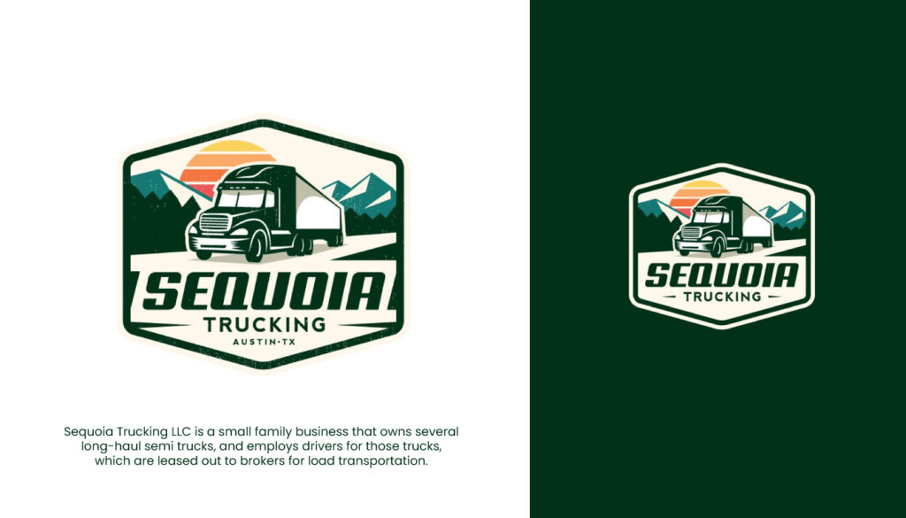
Their Challenge: They are a family operation built on a foundation of reliability and old-school work ethic. They needed to compete with larger fleets by leaning into their core strength: trust. Their logo had to communicate that they are grounded, dependable, and here to stay.
Our Strategy: Strength, Heritage, and the Open Road
We needed to create a feeling of legacy and unwavering strength, inspired by the giant sequoia trees. This called for a completely different visual language than the PTLS project.
- The Form: We designed the logo as a rugged, hexagonal badge. A badge or emblem instantly communicates heritage and acts as a seal of quality. It feels official and established.
- The Illustration: The custom illustration of the truck against a backdrop of mountains and a setting sun tells a story of the American open road. It’s classic, and it connects on an emotional level.
- The Typography: The font for “SEQUOIA” is strong, wide, and confident. It’s a slab-serif typeface that feels industrial and solid, like it’s bolted right onto the chassis.
- The Colors: The deep green and warm sun colors reinforce the connection to nature, strength, and the American landscape.
The Result: The Sequoia Trucking logo is a mark of pride. When a broker sees this logo, it communicates stability and a commitment to quality. It doesn’t look like a fleeting startup; it looks like a multi-generational promise.
The Industry Voice: A Logo for a Media Publication (The Trucker)
The Client: The Trucker, an online and print publication for news and driver recruiting in the trucking industry.
Their Challenge: As a media brand, their logo needed to feel authoritative, credible, and approachable. It had to be instantly recognizable but also clean enough to work across a website, a magazine cover, and social media profiles.
Our Strategy: Clean, Clever, and Credible
This design was all about balance. We needed the power of a truck icon, but with the polish of a modern media company.
- The Icon: We designed a stylized, forward-facing truck icon. By simplifying the details and focusing on strong, clean lines, we created a symbol that is modern and powerful. The icon is contained in a soft, squared-off shape, which makes it feel organized and contained, like a trusted news source.
- Smart Typography: The typography for “THE TRUCKER” is a clean, sturdy sans-serif. It’s highly legible and professional. Placing the “THE” above the “T” in “TRUCKER” creates a neat, interlocked composition that is unique and memorable.
- Professional Palette: The teal and orange color palette is a professional and engaging combination. It stands out from the typical reds and blues of the industry, positioning “The Trucker” as a fresh, modern voice.
The Result: A logo that is a perfect representation of an industry-leading publication. It is professional, instantly identifiable, and works seamlessly across all media platforms, which is the cornerstone of great brand activation.
The Anatomy of a Powerful Truck Logo Design
So, what are the raw materials we work with? It’s not magic. It’s a strategic combination of key elements, each chosen for a specific purpose.
The Power of Typography: More Than Just Your Name
Your choice of font is your brand’s tone of voice. Is it shouting? Is it speaking with quiet confidence? Is it modern and efficient, or is it traditional and reliable?
The Great Divide: Serif vs. Sans-Serif
- Serif Fonts: These are the fonts with the little “feet” on the ends of the letters (think Times New Roman). In the trucking world, they convey a sense of history, tradition, and reliability. A heavy, slab serif can feel industrial and strong. Think of Sequoia Trucking’s logo.
- Sans-Serif Fonts: These fonts are clean, with no “feet” (think Arial or Helvetica). They feel modern, efficient, and direct. For a logistics tech company like PTLS or a modern fleet, a custom sans-serif font is almost always the right choice.
The Custom Difference
A truly unique brand often requires a custom or heavily modified typeface. The precise spacing between letters (kerning), the weight of the lines, and the unique curves—these are the details that elevate a logo from generic to premium. It’s the difference between a suit off the rack and a bespoke, tailored garment.
The Psychology of Color: Setting the Tone Instantly
Color is a shortcut to the brain. The colors you choose for your brand will trigger immediate, subconscious feelings in your potential clients.
- Blue: The undisputed king of corporate colors. It communicates trust, dependability, and calm. It’s a safe, powerful choice for any logistics company.
- Red: Evokes a sense of speed, urgency, and power. If your key differentiator is fast delivery, red is a strong contender.
- Black & Gray: These colors communicate strength, sophistication, and industrial power. A monochrome palette can look incredibly bold and confident.
- Green: Often associated with the earth and outdoors. It’s a great choice for companies that haul agricultural products or want to project a grounded, reliable image.
Symbols and Shapes: Building Your Icon
Should you even use a truck in your logo? It depends on your story.
Literal vs. Abstract
For a company like Sequoia Trucking, a literal (though stylized) truck was essential to the story of heritage and the open road. But for PTLS, a literal truck would have been counterproductive. An abstract mark that hinted at movement was far more effective for their tech-focused brand.
The Power of the Badge
Emblems and badges, like we used for Sequoia, are incredibly powerful in this industry. They feel like a mechanic’s patch or a quality seal on an engine. They communicate a hands-on, built-to-last ethos that resonates deeply with the values of trucking.
Your Questions, Answered.
I talk to business owners in this space all the time. Here are the questions that always come up.
Your Logo Is Your First Move
In logistics, every detail matters. The efficiency of your routes, the maintenance of your fleet, the professionalism of your drivers. Your brand identity is no different. It’s a critical piece of your operational toolkit.
Don’t let a generic logo tell the wrong story about your business. It’s time to invest in a brand mark that communicates the same level of seriousness and professionalism that you bring to every single haul.
If you’re ready to have that conversation, we’re here to listen. Learn more about me and the Evoke philosophy on our about page, or if you’ve seen enough, get in touch directly at madebyevoke.com. You can also find more of my thoughts on our blog. Let’s contact us and build a brand that commands respect.
Leave a Reply