Aerion is a leader in cognitive performance via VR and AI, but their initial brand was trapped in a generic AI generation. We reengineered their visual authority to resonate across US, UK, and Spanish markets.
The original AI-generated icon was a generic letter A that lacked the mathematical depth required for a multinational tech leader. We identified a total lack of symmetry which made the brand feel unstable in high-fidelity VR environments.
Every anchor point was hand-plotted to ensure zero pixelation on retina displays. We replaced all AI artifacts with professional, international-grade sans-serif fonts to establish market authority.
We translated the vector identity into professional tactile business cards, utilizing premium stocks for Aerion's US and European executive teams.
The brand was extended into a high-end merchandise system, ensuring the new logo maintains absolute clarity on corporate apparel and hardware.
The final Aerion identity is now a professional-grade asset system. No longer a low-resolution prototype, it leads the way in immersive VR experiences designed for cognitive training and mental health.
Direct technical insights regarding the Aerion multinational reconstruction.
The initial generation was a "generic prototype" that lacked the mathematical precision required for a global leader. It suffered from symmetry failures that made it appear unstable in VR environments.
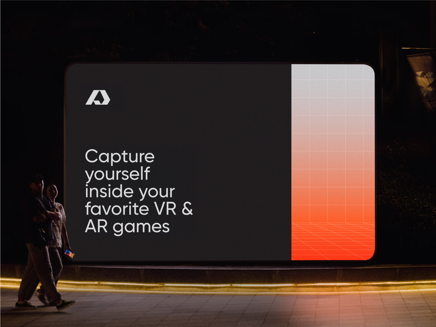
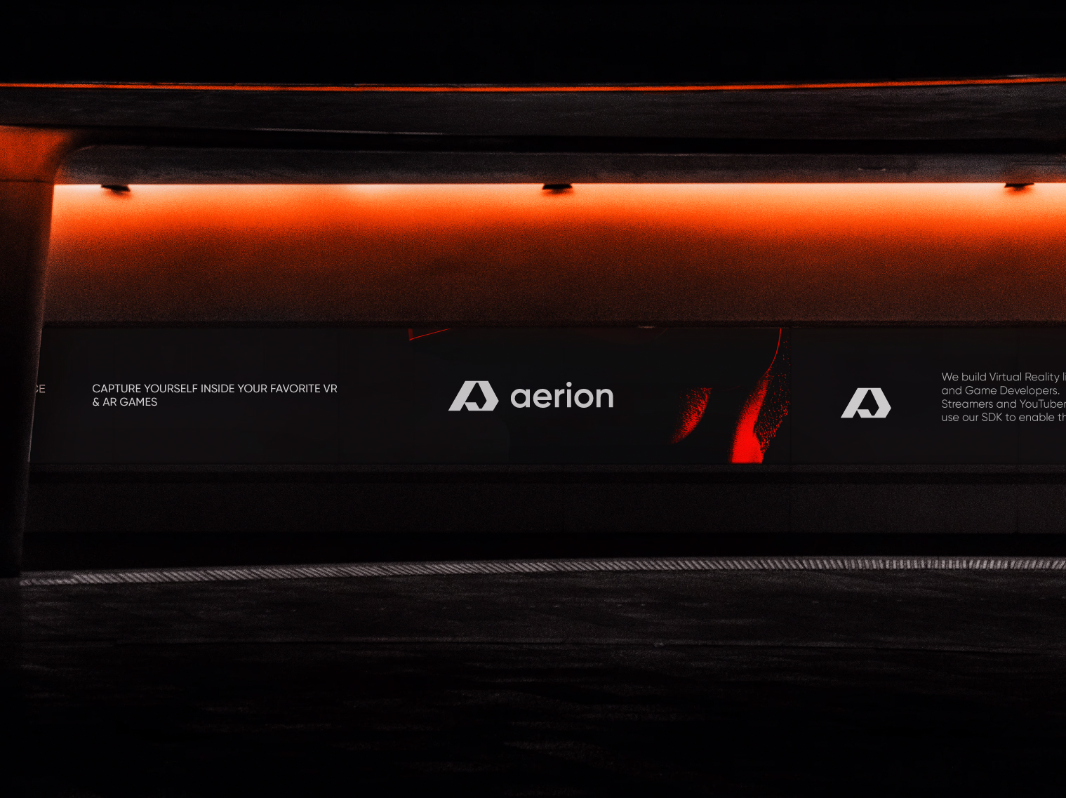
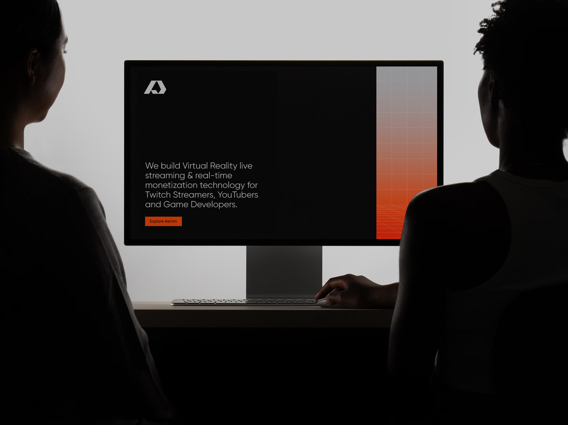
We implemented professional font mapping and high-authority sans-serif typography that resonates with international tech markets while maintaining absolute legibility.
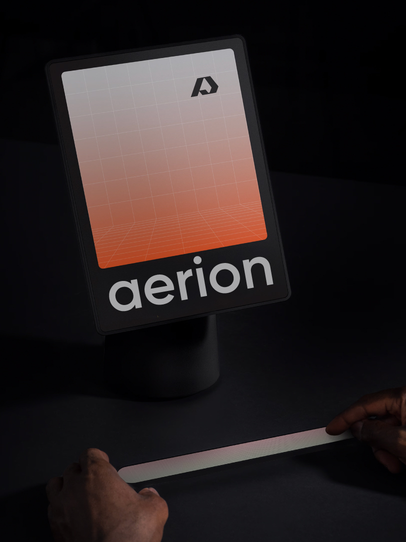
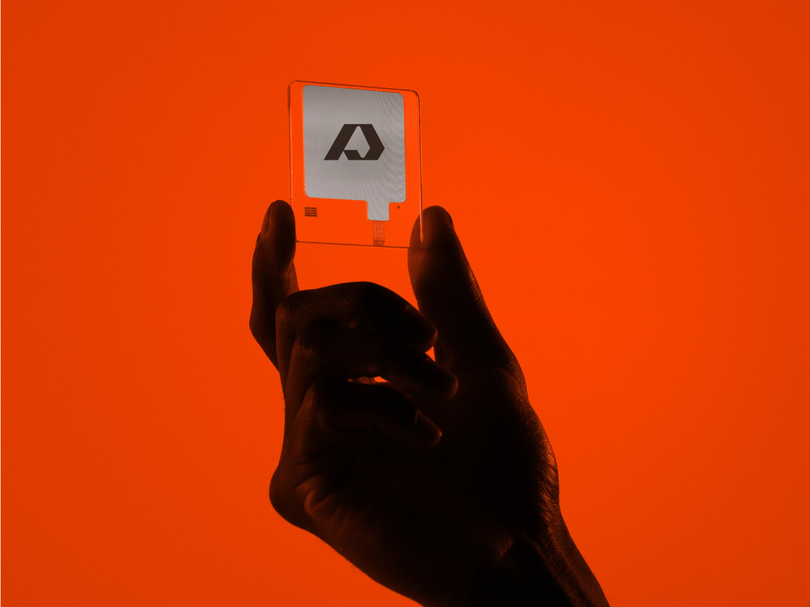
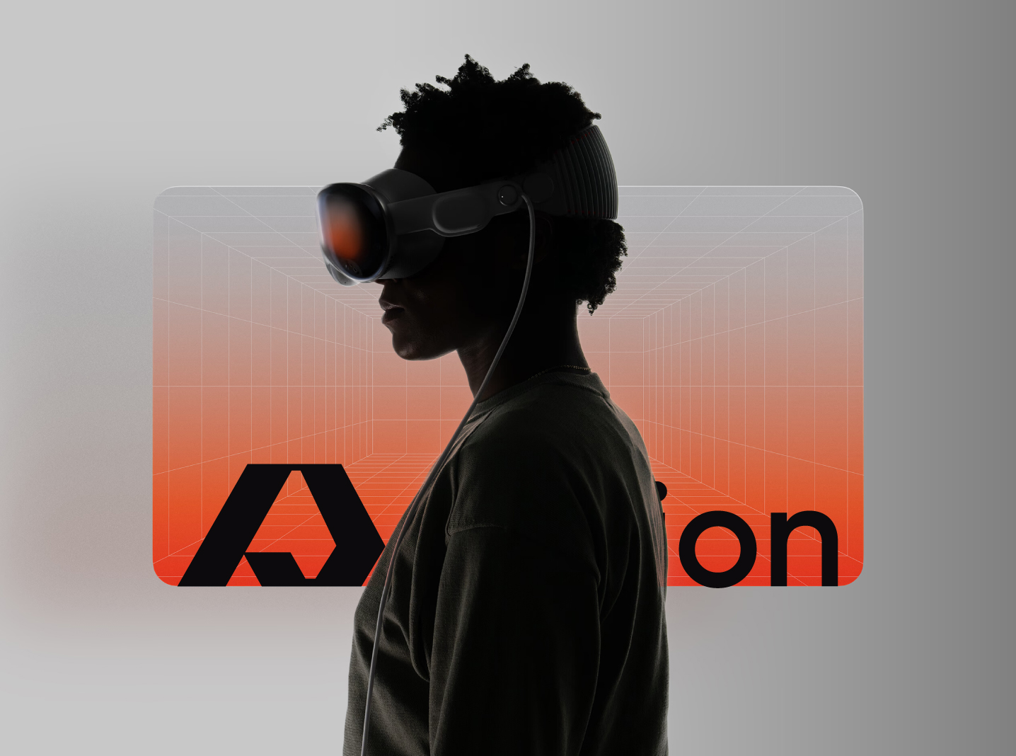
Yes. Every path was hand-plotted using manual Bezier curves to ensure zero pixelation on high-density retina displays and immersive VR lenses.
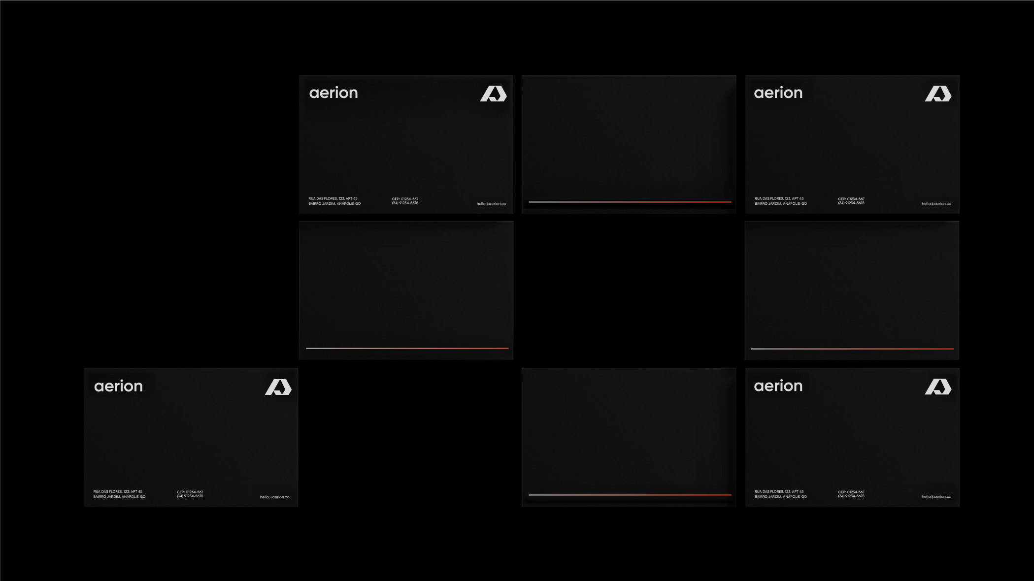
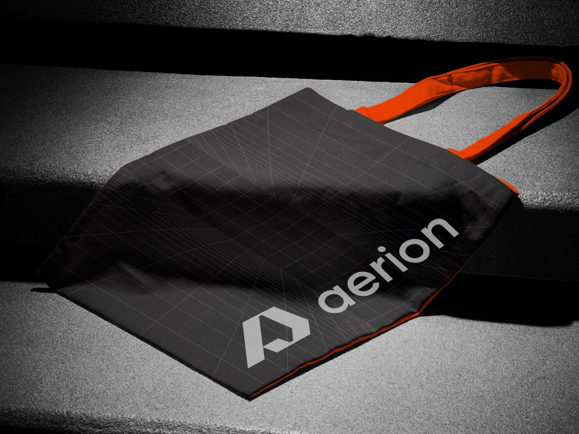
The suite included master vector files (SVG, AI, PDF) and specialized layouts for business card architecture and global corporate merchandise.