When it comes to movie posters, every detail matters. Fonts, in particular, play a crucial role in conveying the tone, era, and mood of a film. Among the vast array of typefaces, serif fonts have a timeless charm that can make a poster stand out. In this post, we’ll explore the top 10 poster of movies with serif font, dissecting what makes each design iconic.
Why Serif Fonts?
Serif fonts are more than just a design choice—they are a storytelling tool. Known for their classic and elegant feel, these fonts have long been a favorite in the world of graphic design. They evoke a sense of tradition, authority, and trustworthiness, making them a natural fit for creating impactful movie posters.
As Mehedi Hasan, Co-founder of Evoke Branding Agency, puts it:
"Serif fonts are like the unsung heroes of design—they carry the weight of history and yet adapt effortlessly to modern storytelling."
But don’t just take my word for it. A study published by the American Institute of Graphic Arts (AIGA) highlights that serif fonts are perceived as more credible and professional than sans-serif fonts in visual communication. This perception makes them ideal for evoking emotional resonance, whether for a period drama, a thrilling mystery, or a heartfelt romance.
Whether you're designing for film, brand identity, or digital campaigns, serif fonts offer unmatched versatility. Want to explore more about using fonts to craft timeless designs? Check out our insights on brand strategy and identity.
1. The Godfather (1972)
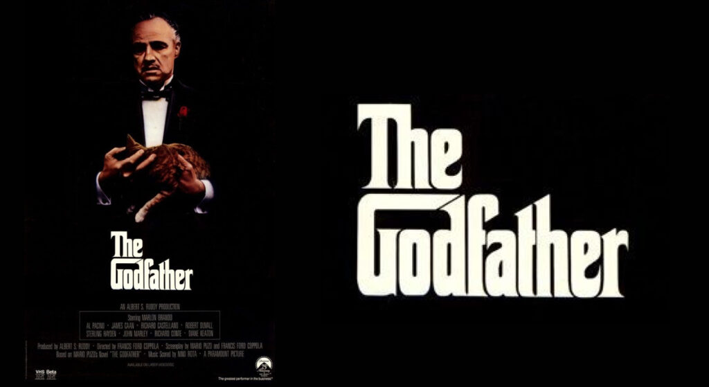
Font Used: Corleone
The poster for The Godfather is often heralded as a masterclass in minimalist design, and much of its power comes from the serif font. This font, inspired by Corleone, was carefully chosen to mirror the film’s themes of tradition, authority, and control. Its classic structure lends a sense of gravitas and permanence, qualities that align perfectly with the story of the Corleone family.
But it’s not just the font that makes this poster iconic. The addition of the puppet strings tied to the title transforms the typeface into a storytelling device. The strings symbolize the control and manipulation central to the narrative, emphasizing Don Vito Corleone’s role as the master puppeteer of his empire.
This combination of typography and imagery was groundbreaking for its time. The simplicity of the design broke away from the crowded, illustrative posters of earlier decades, signaling a new era in movie marketing. It was a deliberate choice to reflect the film’s nuanced exploration of power and morality.
The Godfather poster remains a source of inspiration for designers and branding experts today, showing how the right serif font can elevate a design from good to legendary.
For insights on how to craft similarly impactful designs, explore our work at Evoke Branding Agency.
2. Pride & Prejudice (2005)
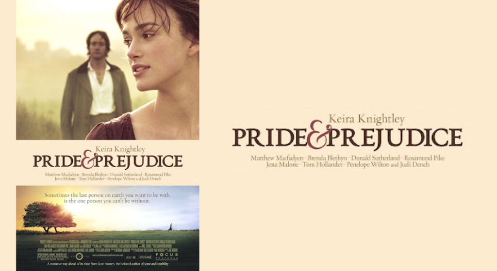
Font Used: Trajan
The Pride & Prejudice poster perfectly reflects the elegance and romance of the story it represents. Using Trajan, a font steeped in classical history, was no coincidence. Trajan, designed in 1989 by Carol Twombly, is inspired by the Roman inscriptions found on Trajan’s Column, dating back to 113 AD. It’s like the designers wanted to tell us, “This story is timeless—just like this font!”
Trajan exudes sophistication and grace, which complements the soft, romantic visuals of Elizabeth Bennet and Mr. Darcy. The wide letter spacing and sharp serifs draw your attention without overpowering the delicate imagery.
Think about it: what better way to tell audiences that this is a story of enduring love than by using a typeface rooted in ancient history? Personally, I find this pairing brilliant. Do you agree?
If you’re curious about pairing fonts with visual narratives, check out how we at Evoke blend timeless design principles with modern creativity.
3. Titanic (1997)
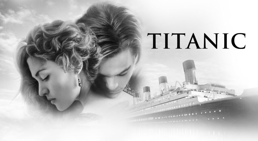
Font Used: Trajan Pro
When you think of Titanic, grandeur, tragedy, and love likely come to mind. The movie’s poster encapsulates all of that with its choice of Trajan Pro, a slightly modernized version of the Trajan font. This serif font brings an air of authority and timelessness, just like the story of the ill-fated ship.
Trajan Pro’s clean lines and classical roots anchor the poster in a sense of history. It reminds us that Titanic isn’t just a love story—it’s a monumental tale of human ambition and vulnerability. And those large, elegant letters? They almost feel like the towering walls of the ship itself, don’t they?
Let me ask you this: would a sans-serif font have captured the same depth and emotion? Probably not.
4. The Grand Budapest Hotel (2014)
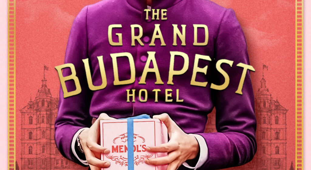
Font Used: Archer
Wes Anderson’s The Grand Budapest Hotel is nothing if not a visual feast, and the poster design is no exception. Archer, the serif font used, strikes a balance between modern quirkiness and old-world charm.
Did you know Archer was originally designed in 2001 for Martha Stewart Living? It’s a font that exudes friendliness while maintaining a certain sophistication—exactly like the Grand Budapest Hotel itself.
Here’s why I love this pairing:
- Quirk meets class: Archer’s rounded serifs add a playful touch that perfectly complements Anderson’s whimsical storytelling.
- Historical echoes: The font subtly hints at the hotel’s rich, nostalgic past.
Honestly, I think Archer was the perfect choice for this design. Do you feel the same?
For tips on mixing whimsy with elegance in design, check out our blog.
5. Atonement (2007)
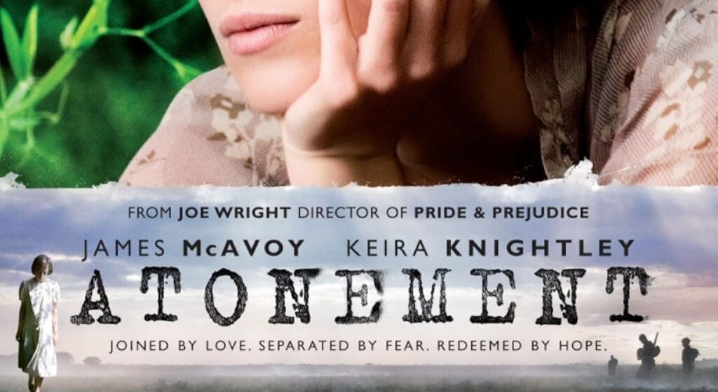
Font Used: FF Trixie
The poster for Atonement is a masterstroke of emotion. Using FF Trixie, was a deliberate choice to evoke nostalgia and depth. FF Trixie’s delicate curves and sharp serifs make it one of the most timeless typefaces in history.
The font pairs beautifully with the ethereal imagery of the characters. It’s almost as if the letters are whispering the story to you. Do you feel that too?
6. Black Swan (2010)
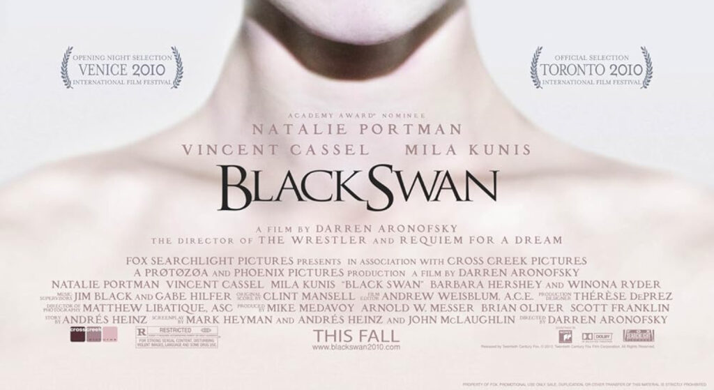
Font Used: Trajan Pro
Baz Luhrmann's Black Swan (2010) takes us back to the roaring '20s, and its film poster evokes the elegance and extravagance of that time. Trajan Pro, which is often associated with timeless, monumental themes, is the perfect font choice for a movie that is equal parts opulence and tragedy.
Why Trajan Pro Works:
- Monumental Elegance: Trajan Pro’s classic design, inspired by Roman inscriptions, gives a sense of timelessness, fitting the film's exploration of love, wealth, and decay.
- Luxury and Power: The serif font's boldness adds a sense of authority and grandeur, mimicking the towering presence of Gatsby himself.
- Period Appropriateness: The use of a font inspired by ancient inscriptions subtly connects the film to a more classic era while elevating the narrative of ambition and the American Dream.
Doesn't the choice of Trajan Pro remind you of how Black Swan's story is both historical and eternal in its themes? What do you think—does the font reinforce the atmosphere of the film for you?
For more insights into how fonts can elevate your design, check out our brand activation services.
7. The Crown (2016)
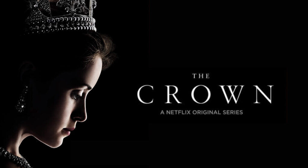
Font Used: Garamond Premier
The Crown TV series is a regal exploration of British monarchy, and its poster design mirrors this magnificence. The font Garamond Premier, with its roots in 16th-century French typography, brings a sense of timeless elegance and authority to the visuals.
Garamond Premier is an updated version of Claude Garamond's original design. It is widely known for its refined proportions and delicate serifs, making it a top choice for conveying prestige and tradition—perfectly aligning with the show's theme.
Why Garamond Premier Fits the Bill:
- Royal Elegance: The soft curves and sharp serifs give the poster a classic and noble appearance, fitting for a series about royalty.
- Timelessness: This font evokes the historical span of The Crown, which depicts decades of monarchical history, from Queen Elizabeth II’s ascension to modern times.
- Sophistication: The typeface’s exquisite balance between readability and style ensures the poster looks dignified without being overbearing.
When you see the poster, doesn’t it feel like you’re stepping into the grandeur and complexity of royal life? It’s amazing how the right font can subtly communicate so much.
If you’re curious about using such timeless elements in your designs, check out our approach to brand strategy and identity. Let’s create something equally iconic!
8. Sully (2016)
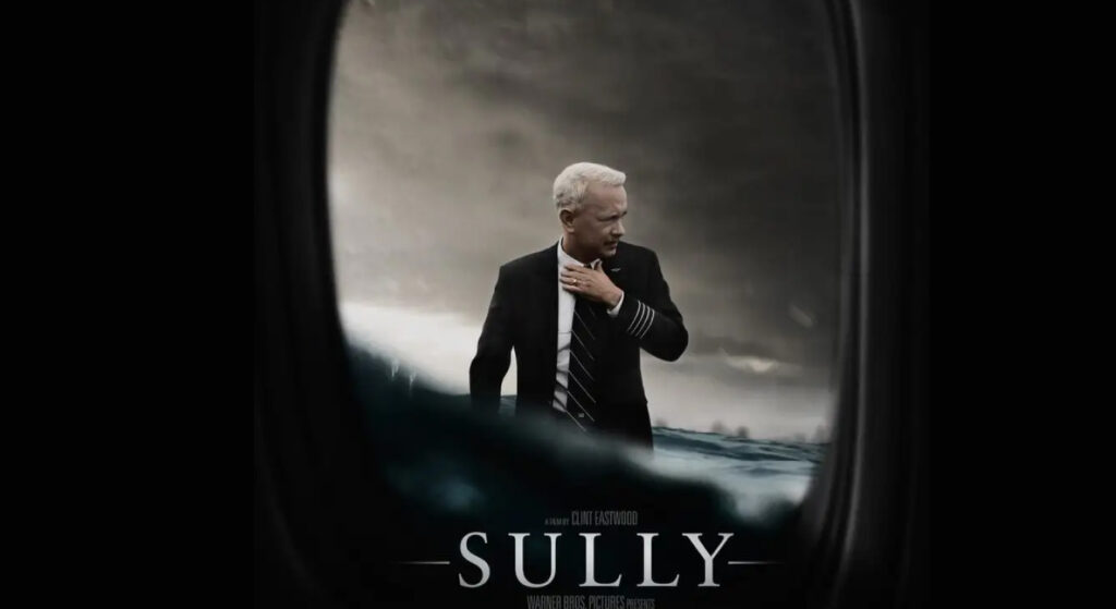
Font Used: Trajan Pro
The poster for Sully, a biographical drama about the "Miracle on the Hudson," uses Trajan Pro to convey strength, resilience, and authority. Trajan Pro is a go-to typeface for serious, impactful storytelling, often associated with historical and dramatic narratives.
For a film centered on Captain Chesley “Sully” Sullenberger’s heroic emergency landing, the font choice reflects the weight of responsibility and the enduring legacy of the event.
Why Trajan Pro Works for Sully:
- Timeless and Monumental: Inspired by ancient Roman inscriptions, Trajan Pro brings a sense of timelessness to the story, underscoring the gravity of Sully's achievement.
- Professionalism and Authority: The clean, confident lines of the font mirror Sully's composed demeanor during a life-or-death situation.
- Emotional Gravitas: The serif font’s boldness and precision align with the emotional depth and seriousness of the film’s themes.
When you glance at the poster, don’t you feel a sense of awe and respect for Sully's calm heroism? That’s the power of Trajan Pro—it commands attention and adds gravitas to the narrative.
Curious about how thoughtful font choices can amplify storytelling? Let’s collaborate! Discover more at our brand activation page.
FAQ
Q. Why are serif fonts so popular in movie posters?
Ans. Serif fonts convey elegance, professionalism, and a sense of tradition. Their versatility allows them to suit various genres, making them a favorite for cinematic designs.
Q. How do I choose the right serif font for my poster?
Ans. Consider the film's genre and tone:
- Use classic fonts like Garamond for period dramas.
- Opt for modern serifs like Archer for quirky or contemporary stories.
- Experiment with custom serifs for sci-fi or fantasy.
Q. Can serif fonts work in minimalist designs?
Ans. Absolutely! Serif fonts add subtle sophistication to minimalist designs. Fonts like Baskerville or Caslon can make a bold statement with minimal elements.
Q. What tools can I use to find great serif fonts?
Ans. Explore these resources:
- Google Fonts for free serif options
- Adobe Fonts for premium and unique styles
- Font Squirrel for curated selections
Q. How can Evoke help with my poster design?
Ans. At Evoke, we specialize in crafting timeless designs that resonate. Whether it’s brand strategy or identity creation, our services can bring your vision to life. Contact us here to learn more!
Wrapping It Up: Serif Fonts Steal the Spotlight
So, there you have it—the top 8 poster of movies with serif font that have captured our hearts and imaginations. From the timeless elegance of The Godfather to the whimsical charm of The Grand Budapest Hotel, these designs show just how powerful serif fonts can be in telling a story.
Serif fonts aren’t just a choice—they’re a statement. They whisper history, shout authority, and evoke emotion in a way that no other typeface can. Whether you’re designing for film, branding, or personal projects, the right serif font can elevate your work from ordinary to extraordinary.
Now, I’ll leave you with a challenge: next time you’re designing, why not experiment with a serif font and see how it transforms your work? And if you need a helping hand, we at Evoke Branding Agency would love to collaborate with you. Let’s create something timeless together.
What’s your favorite movie poster with a serif font? Let’s talk in the comments—I’d love to hear your thoughts!