
In the world of typography, few names command as much respect as Paula Scher. Known for her bold, innovative approach, Scher has redefined how we view and use typefaces in modern design. To explore the history about Neue typeface from Paula Scher, it’s essential to understand how she has masterfully worked with classic typefaces like Neue.
Although Scher didn’t design Neue—it was originally created by Max Miedinger and Eduard Hoffmann in Switzerland—her genius lies in reinventing and breathing life into such timeless fonts, elevating them into bold and impactful designs.
If you’re curious about Paula Scher’s creative process with typefaces, check out what font did Paula Scher created.
The Origins of Neue Typeface
To truly appreciate Paula Scher’s influence with Neue, we first need to dive into the typeface’s storied origins and its revolutionary impact on modern typography. Neue, or Neue Haas Grotesk, was not just a product of design—it was a response to the shifting cultural and aesthetic movements of the mid-20th century.
A Creation Rooted in Modernism
Neue Haas Grotesk was crafted in the 1950s by Max Miedinger, a Swiss type designer, in collaboration with Eduard Hoffmann. Together, they set out to design a sans-serif typeface that embodied the clean, functional ethos of modernism. Their goal was simple: to create a typeface that was neutral, versatile, and timeless. This design later evolved into what we now know as Helvetica, a name that has become synonymous with minimalist typography.
- Modernist Influence: Drawing inspiration from the Bauhaus movement, Neue Haas Grotesk rejected unnecessary decoration in favor of simplicity and geometric precision. It was designed to prioritize readability, neutrality, and functionality, making it a favorite for designers seeking clarity.
- Global Adoption: Once rebranded as Helvetica, the typeface gained worldwide recognition. Its adaptability made it a staple for branding, advertising, and corporate identity across industries, from government forms to high-end fashion.
Helvetica’s universal appeal proved that typography could transcend design trends and become a tool for clear communication. As Mehedi Hasan puts it,
“A typeface is not simply a design; it’s a vessel for ideas, emotions, and clarity in communication.”
This philosophy mirrors the timeless importance of Neue Haas Grotesk in shaping design principles across generations.
Have a project in your mind?
Let’s communicate.
Get expert estimation

Paula Scher and Neue Typeface
While Paula Scher didn’t design Neue, her genius lies in how she has harnessed its potential. Scher often uses typefaces like Helvetica, Franklin Gothic, and Akzidenz-Grotesk to create bold, unconventional visual systems that break conventions and tell stories.
Her approach to type is not merely functional—it’s transformative. One such example is her work for the Public Theater, where she blended typefaces to create layered, dynamic designs that felt alive and inviting.
For a modern example of how timeless typefaces like Neue are reimagined in branding, check out our recent project with Rivian. The design showcases the versatility of typography in creating a clean, bold identity for a cutting-edge brand.
Paula Scher’s Creative Connection with Neue
While Paula Scher did not design Neue, she has wielded its power in extraordinary ways. Her work demonstrates how even a classic typeface can be reinvented to evoke bold, modern ideas.
Neue in Scher’s Designs
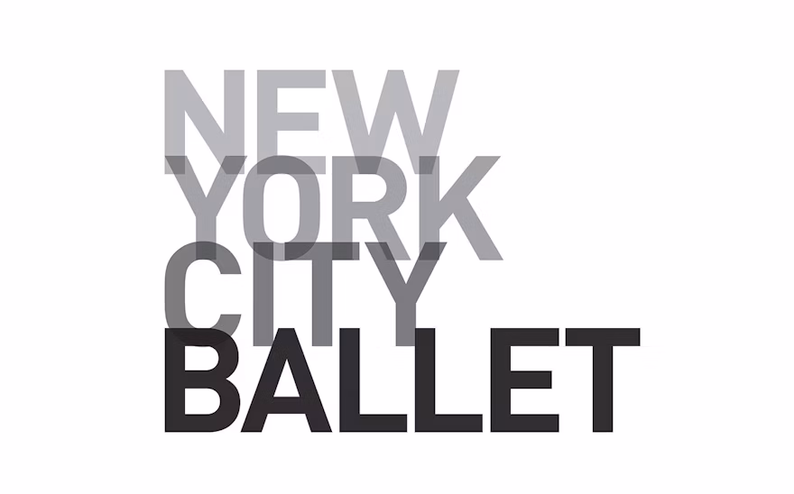
Scher frequently uses bold, clean typefaces like Neue in her branding and environmental graphics projects. One standout example is her work with the New York City Ballet, where she used stark typography to echo the dynamism and elegance of the art form itself.
Scher’s ability to use typefaces like Neue to define space and emotion has made her a modern design legend. She often explains,
“Typography is painting with words.”
Building on Tradition
By pairing the structured simplicity of Neue with her own daring compositions, Scher has proven that typefaces are not static entities but tools to build dynamic, living systems.
To explore how Scher reimagined other fonts, read more about her creation of the Franklin Gothic font.
The Vision of Max Miedinger and Eduard Hoffmann
Max Miedinger: The Architect of Neue
Max Miedinger’s work is pivotal in typography history. As a designer at the Haas Type Foundry in Switzerland, he sought to create a font that embodied modernist values. His partnership with Eduard Hoffmann resulted in a typeface that stripped away decorative elements, focusing solely on functionality and legibility.
Eduard Hoffmann: The Visionary Behind the Scenes
While Miedinger designed Neue, Hoffmann’s role as the project director was instrumental. He guided the development process, ensuring that Neue’s design met the high standards of Swiss modernism.
Cultural Revolution
Neue became Helvetica in 1960, cementing its place in global design history. It symbolized a shift toward simplicity and clarity, influencing brands like American Airlines, IBM, and even NASA.
If you want to dive deeper into the history of typography, check out how mottos shape branding.
Paula Scher and the Legacy of Neue
Paula Scher’s work with Neue is not about reinventing the wheel but about showing how existing tools can redefine creativity. In her environmental graphics for institutions like the Philadelphia Museum of Art, Scher used typefaces like Neue to create dynamic, interactive experiences for viewers.
Scher’s genius lies in her ability to elevate a typeface beyond its original purpose. Through Neue, she demonstrates how modernist ideals can coexist with bold, contemporary designs, creating an intersection of function and emotion.
If you’re intrigued by how Scher uses typefaces to craft visual narratives, explore her thoughts on typography and design strategy.
Why Neue Remains Relevant
Nearly seven decades after its creation, Neue continues to be a cornerstone of design:
- Versatility: Neue’s neutral yet elegant aesthetic makes it suitable for everything from corporate branding to modern art installations.
- Cultural Legacy: Neue reflects an era when design began to embrace minimalism, functionality, and universality.
- Modern Applications: Designers like Paula Scher show how it can adapt to contemporary needs, proving its timelessness.
For more insights into the intersection of history, typefaces, and branding, visit our blog.
Final Thoughts
Paula Scher’s connection to Neue underscores her ability to take timeless typefaces and amplify their impact. Her work reminds us that typography is more than just letters on a page—it’s an art form that bridges past and present, creating meaning in every curve and line.
If you want to see how Paula Scher and other legends use typography to elevate design, contact us to learn how we can bring bold, innovative solutions to your brand.
Have a project in your mind?
Let’s communicate.
Get expert estimation
Leave a Reply