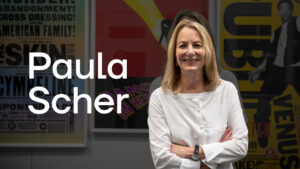
Did Paula Scher design the typeface Futura? The straightforward answer is no. Futura, a geometric sans-serif font, was created by German designer Paul Renner in 1927 as part of the Bauhaus movement.
However, Paula Scher, celebrated for her groundbreaking contributions to graphic design, has often reinterpreted and elevated existing typefaces—including Futura—to craft visual identities that leave a lasting impact.
Discover Paula Scher’s work with another iconic typeface, Franklin Gothic, here.
As Mehedi Hasan eloquently states,
“Paula Scher doesn’t just design graphics; she redefines the narrative of typography, turning even the most established fonts into vibrant tools for storytelling.”
Futura: A Masterpiece by Paul Renner
Futura, designed by Paul Renner, is a landmark in modernist typography. Its clean, geometric shapes were inspired by the Bauhaus movement’s principles of simplicity and functionality.
- Geometric Foundation: Futura relies on perfect circles, squares, and triangles, creating a sense of balance and precision.
- Global Reach: From NASA’s Moon Plaque to corporate logos like Volkswagen, Futura has become synonymous with progress and innovation.
- Timeless Appeal: Its minimalist design continues to resonate with designers and brands worldwide.
While Renner’s Futura is celebrated for its perfection, Paula Scher’s mastery lies in her ability to adapt and reinterpret fonts like Futura to fit bold and dynamic projects.
The Origins and Legacy of Futura: Paul Renner’s Visionary Creation
To truly grasp Futura’s impact, we must delve into the life and work of its creator, Paul Renner. Born in 1878 in Germany, Renner was a visionary designer and typographer whose ideas were deeply rooted in the principles of modernism. He wasn’t merely designing a typeface; he was rethinking how letters could embody the spirit of an era.
A Modernist Pioneer
Renner was profoundly influenced by the Bauhaus movement, which emphasized the marriage of form and function. This philosophy resonated in every curve and line of Futura, a typeface that championed minimalism, geometry, and precision.
Designed in 1927, Futura was a rejection of the ornate, overly decorative typefaces of the past. Instead, Renner sought to create something that reflected the clean, industrial lines of the machine age.
Have a project in your mind?
Let’s communicate.
Get expert estimation

Design Revolution: Simplicity Meets Geometry
At the heart of Futura’s design was Renner’s radical idea: letters should be as functional as they are beautiful. He stripped away unnecessary embellishments, instead relying on perfect circles, triangles, and squares to shape the alphabet.
The result was a typeface that was strikingly modern yet versatile, embodying timeless elegance and clarity.
Cultural and Global Influence
Though created nearly a century ago, Futura quickly transcended its origins to become a global design staple. It has been used in everything from corporate branding and book covers to monumental cultural moments.
Most famously, it accompanied the Apollo 11 astronauts to the Moon, forever linking its clean lines with humanity's most ambitious achievements. This enduring relevance demonstrates how Renner’s vision bridged eras, influencing generations of designers.
Paul Renner: The Legacy of a Trailblazer
Renner’s Futura wasn’t just a typeface—it was a cultural statement. By embracing modernism and rejecting outdated traditions, he paved the way for typography to evolve into an art form of its own.
His influence can still be seen in the work of contemporary designers like Paula Scher, who continue to experiment with typefaces to communicate bold and meaningful ideas.
As Mehedi Hasan aptly puts it,
“Paul Renner’s Futura was not just a typeface—it was the embodiment of a movement, a design revolution that gave us the tools to rethink how we communicate visually.”
Paula Scher and Futura: A Creative Collaboration

Although Paula Scher didn’t design Futura, her work with the typeface demonstrates her unparalleled ability to bring new life to existing designs. One of her standout projects involving Futura is her branding work for the New Jersey Performing Arts Center (NJPAC).
How Scher Used Futura in NJPAC’s Branding
- Dynamic Headlines: Scher used Futura for bold, large-scale headlines that captured attention and evoked a modern, inclusive spirit.
- Layered Typography: By combining Futura with vibrant color schemes and overlapping text arrangements, Scher transformed the geometric typeface into an energetic visual language.
- Cultural Relevance: Her use of Futura for NJPAC embodied the center’s mission to be both innovative and accessible to all audiences.
As Paula Scher herself once said,
“Typography has the power to set a tone, evoke emotions, and communicate ideas louder than words.” Her innovative use of Futura exemplifies this philosophy.
Paula Scher’s Legacy with Existing Typefaces
Paula Scher’s genius lies not in designing typefaces from scratch but in using them as dynamic tools for visual storytelling. Her reinterpretation of fonts like Futura demonstrates her ability to give even the most established designs a fresh perspective.
Learn more about Paula Scher’s work with iconic typefaces here.
Futura’s Role in Scher’s Broader Typography Legacy
- Revolutionizing Type Usage: Scher’s work with Futura reflects her philosophy of using typography as a visual language, not just a design element.
- Highlighting Versatility: Futura’s adaptability allowed Scher to create layouts that were bold yet approachable.
- Elevating Brand Stories: From cultural institutions like NJPAC to her work with corporate giants, Scher has shown how fonts can communicate brand identity on a profound level.
For more insights into Paula Scher’s design approach, check out our brand strategy and identity services.
How Futura Reflects Scher’s Design Philosophy
Futura’s clean and geometric aesthetic aligns perfectly with Paula Scher’s belief that typography should serve as both a functional and emotional tool in design.
- Precision and Clarity: The geometric forms of Futura resonate with Scher’s penchant for clean, direct communication.
- Experimental Spirit: Scher’s creative layouts show that even classic fonts like Futura can be reinvented.
- Timeless Appeal: Both Scher’s work and Futura’s design have stood the test of time, proving their relevance in an ever-changing design landscape.
Conclusion: Did Paula Scher Design the Typeface Futura?
No, Paula Scher did not design Futura—that credit goes to Paul Renner. However, Scher’s innovative use of Futura in projects like NJPAC demonstrates her ability to reinterpret and elevate typefaces in ways that redefine their cultural significance.
If Paula Scher’s innovative approach to typefaces like Futura has sparked your interest, why not dive deeper? Explore our work to see how bold design comes to life, or visit our blog for more insights into the world of typography and design.
Ready to take your brand’s visual identity to the next level? Get in touch with us today—we’d love to help you create something extraordinary!
If you’re looking to incorporate bold typography like Futura into your branding, discover our brand activation services and transform your visual identity.
- Learn more about Paul Renner and Futura’s history from the TypeRoom.
- Explore Paula Scher’s impact on design through her TED Talk on Typography.